Subject: Pro Wrestling's T-Shirt Design
Aim: To outline my philosophy on good shirt design as it pertains to pro wrestling and to design some pro wrestling designs as an example
Below is a full article I wrote about the pro wrestling's industries t-shirt design philosophy, and why I believe they were (mostly) doing it wrong. As a lot of pro wrestlers themselves get their income from merchandise sales (mostly t-shirts) and use the merchandise as attire, or merely to create a brand around themselves as characters, this piece of paraphernalia becomes far more important for this industry than any other. But a lot of the time I felt there was a misunderstanding from some of the biggest wrestling companies when it pertains to their design philosophy. As a fan and a designer I felt I had a unique outlook on this so I wrote the following article while also putting my process into practice by designing some new merchandise for the pro wrestler 'Jon Moxley'.
Let's talk about Pro Wrestling shirt designs. I'm a graphic designer and the pro wrestling shirt industry has annoyed me for a little while now. I feel like I finally had to say something after AEW started producing designs that were as bad as some of the worst stuff WWE have released.
Shirts in pro wrestling is a topic I find really interesting just because of their possible uses within the actual program, most notably factions, but also if the wrestler wears their own merch like in WWE, that becomes part of their attire. So when it becomes the attire, people will want to also buy it, so when you create a design for a shirt you have to put into consideration that the design will have to feel appropriate to the wrestler wearing it and suits them, but is also appropriate for a fan to wear on a daily basis. I could list a bunch of shirts and do a whole post pointing out what is bad about them. But what it comes down to is those two things, that these designs don't feel appropriate to the character and aren't thought about real world use.
So I came up with some guidelines that every shirt designer for wrestling should implement, and to prove my point, I am also gonna use these guidelines to create some Jon Moxley shirts as I feel his merchandise has been a little lack luster in my opinion. Notice I'm using the word 'guideline', these aren't rules, this is art you can do whatever, but I think these are just things you need to consider.
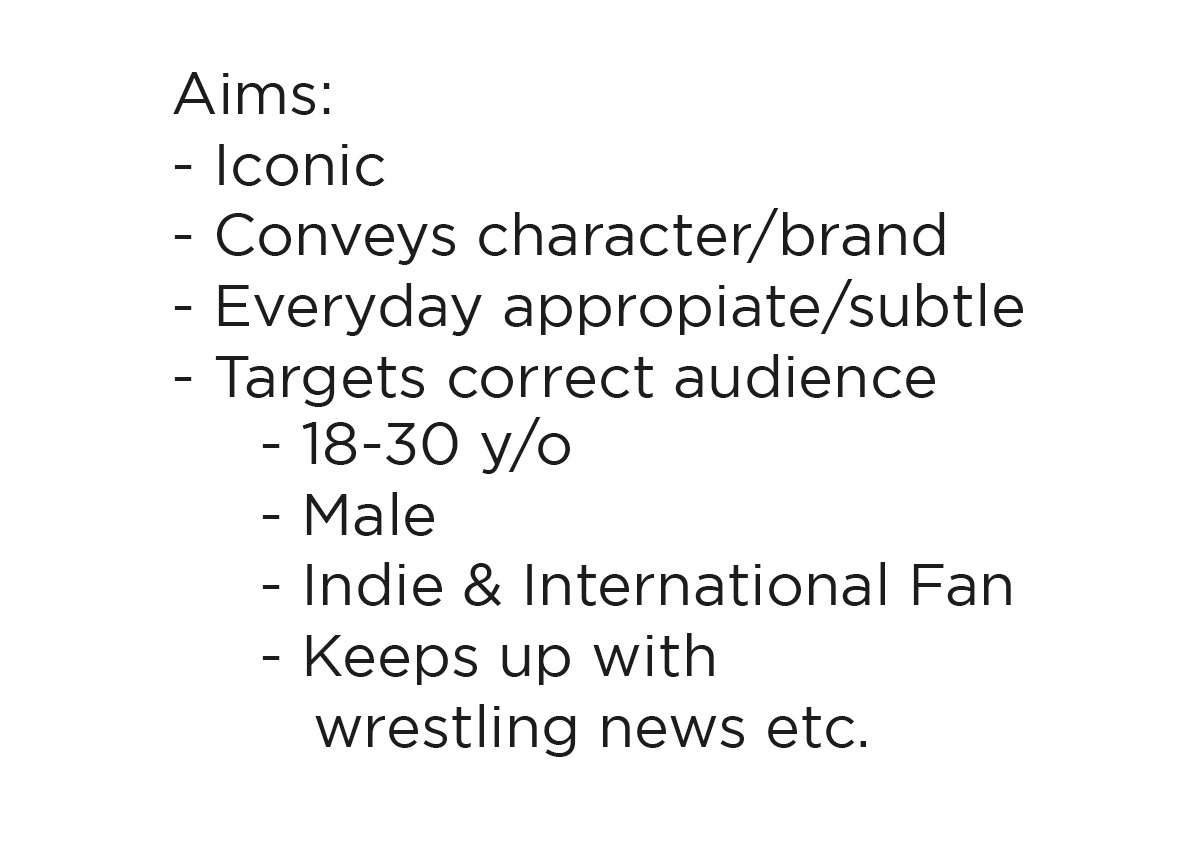
1. It has to be Iconic
For me every designs aim is to be iconic, iconic means memorable, which you want if its something you want to sell or have a wrestler wear a lot as part of attire.
2. Conveys Character or brand
I want the design to feel like that wrestler would wear it or encapsulates that wrestler. Stone Cold wouldn't wear a neon pink Dolph Ziggler styled shirt. Same goes for a fan, I don't want to buy a neon pink Stone Cold shirt, Stone Cold has never worn neon pink and he doesn't come across as someone flashy, who wants to stand out and is flamboyant, using a pink shirt sends that message.
3. Everyday appropriate/subtle
When I buy a shirt, I will wear it as part of my wardrobe. If your shirt is a 'I'd only wear this at a wrestling event' then I think you're doing it wrong. My main gripe is outlandish colours or text that says something that can be perceived as inappropriate. I think this may be personal preference though as I have seen lots of fans wear stuff I would never touch.
4. Target the correct audience
What the buyer wants is completely based on who that person is, their age, gender, what they like, what they do, etc. Creating a Target Audience for your product is what every company does. It's why, even when I loved John Cena's run as US champion in 2015, I wouldn't buy his shirt because it was aimed at the younger demographic.
I would now talk about all of my prep for creating Mox's shirt designs, but I think that would be a bit long and tedious so instead I'm going to just show you my mood boards and scamping (sketching) in images then talk through each idea I had.


Mox Symbol Designs
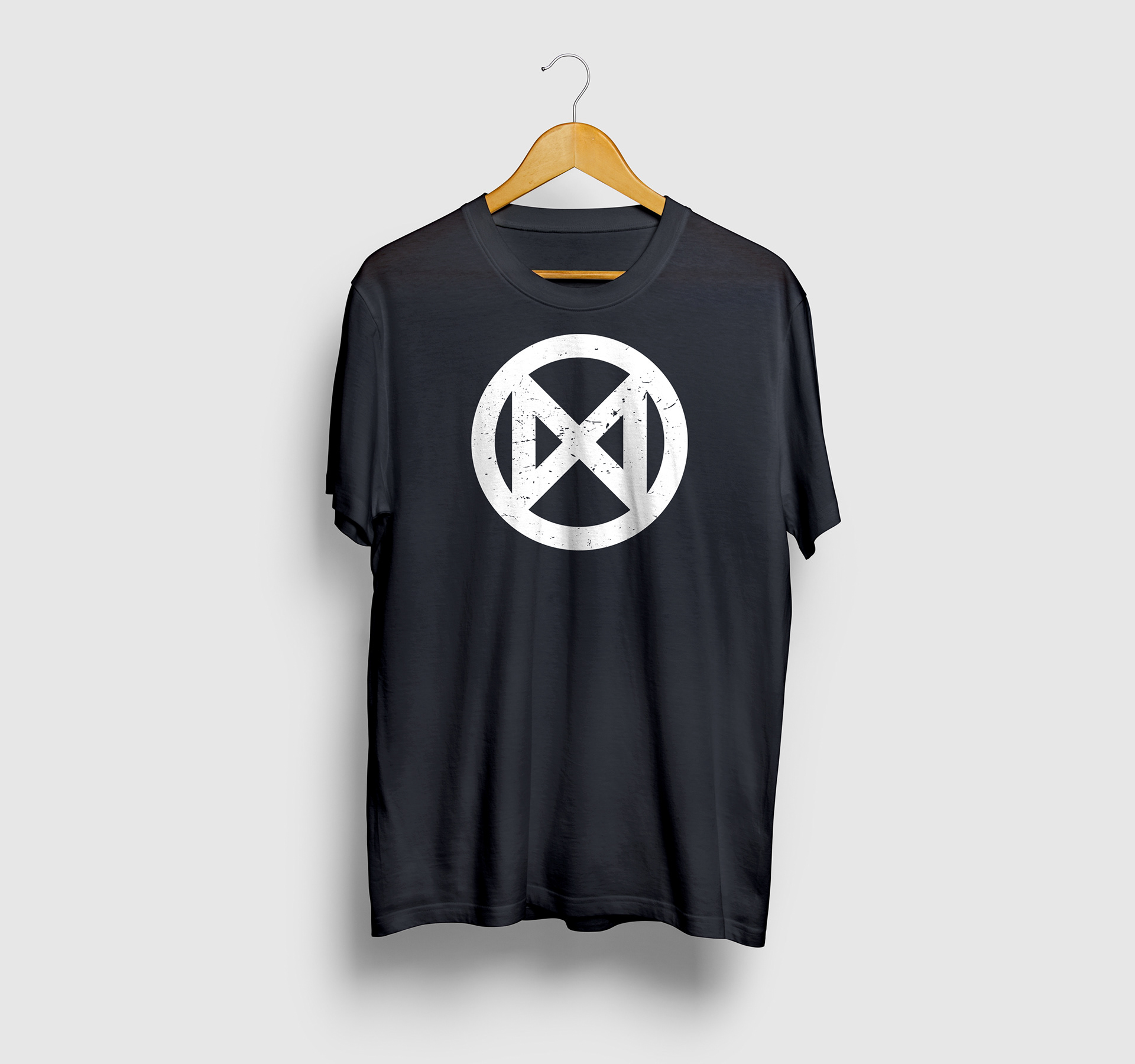

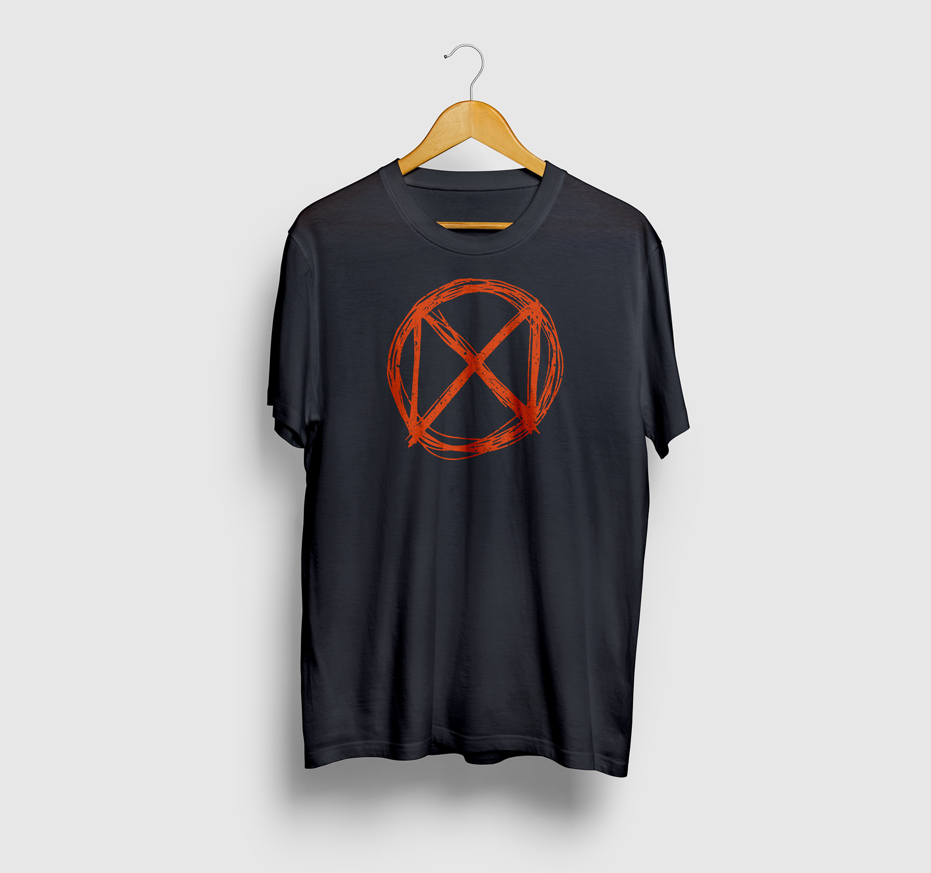
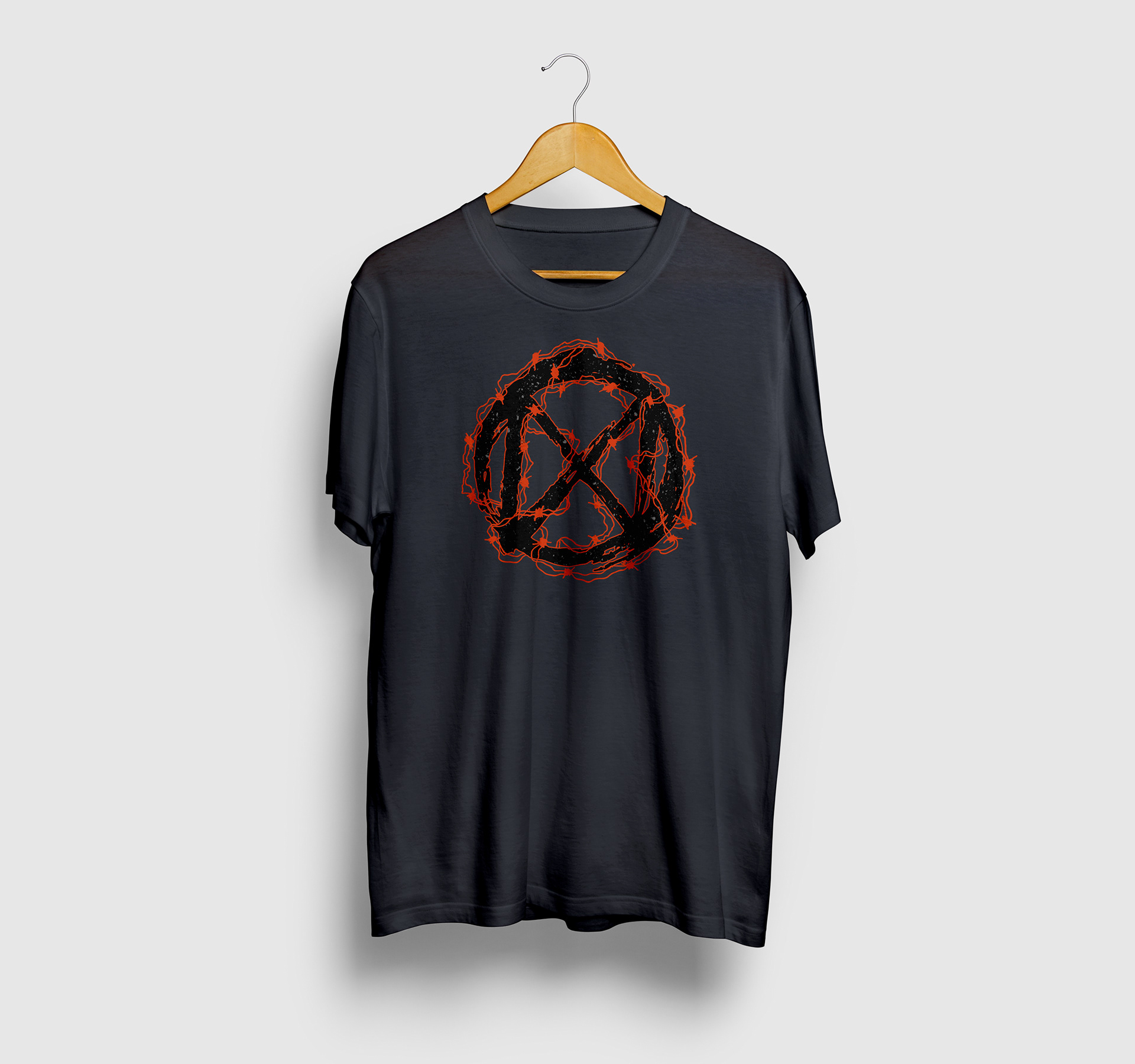
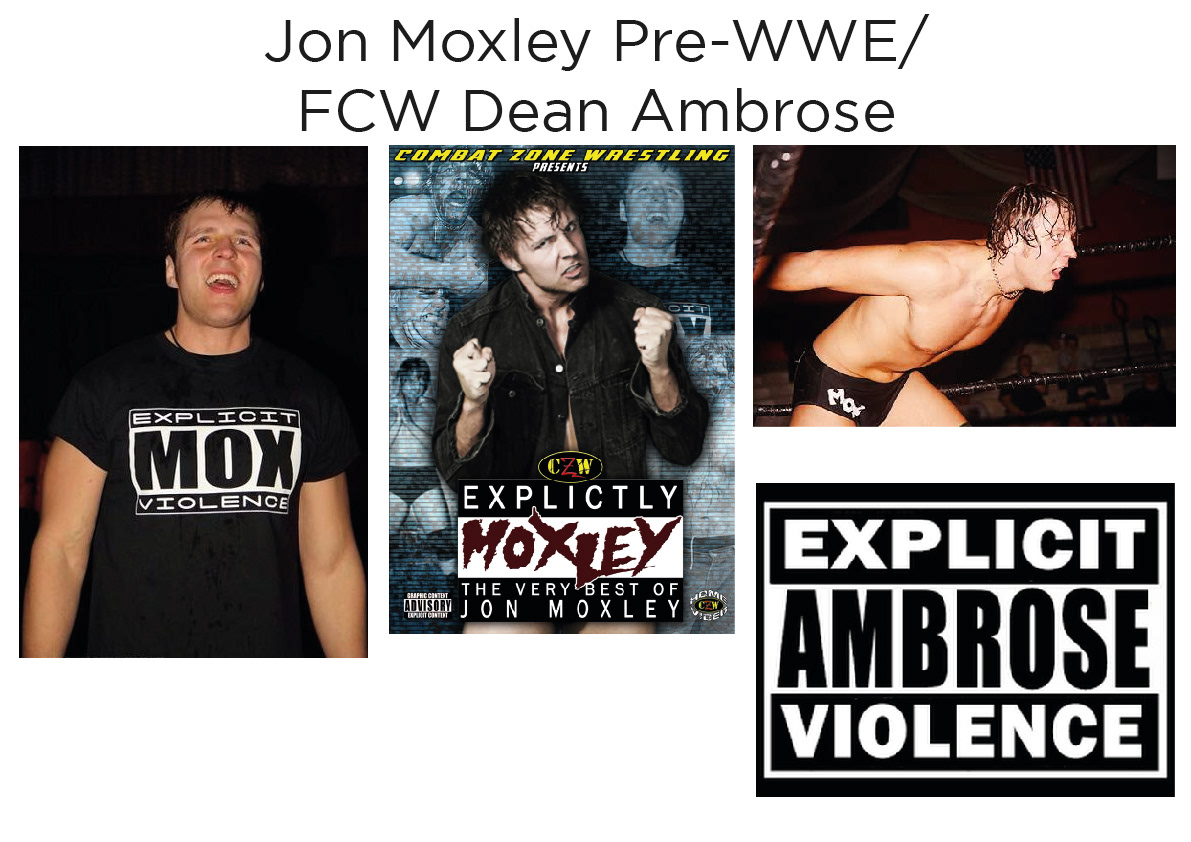
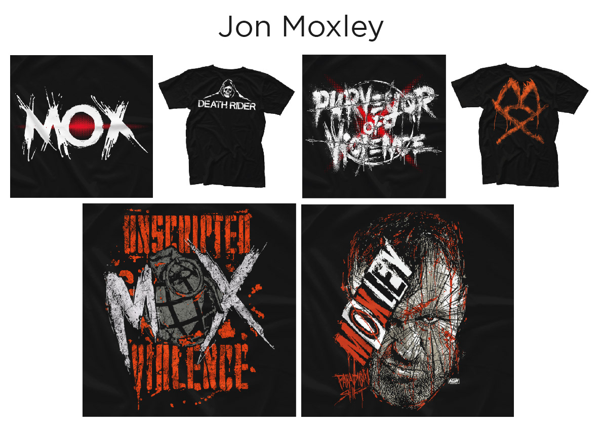
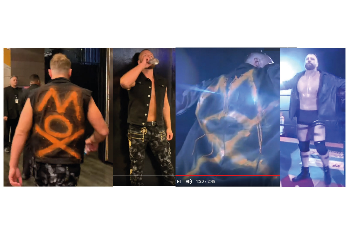
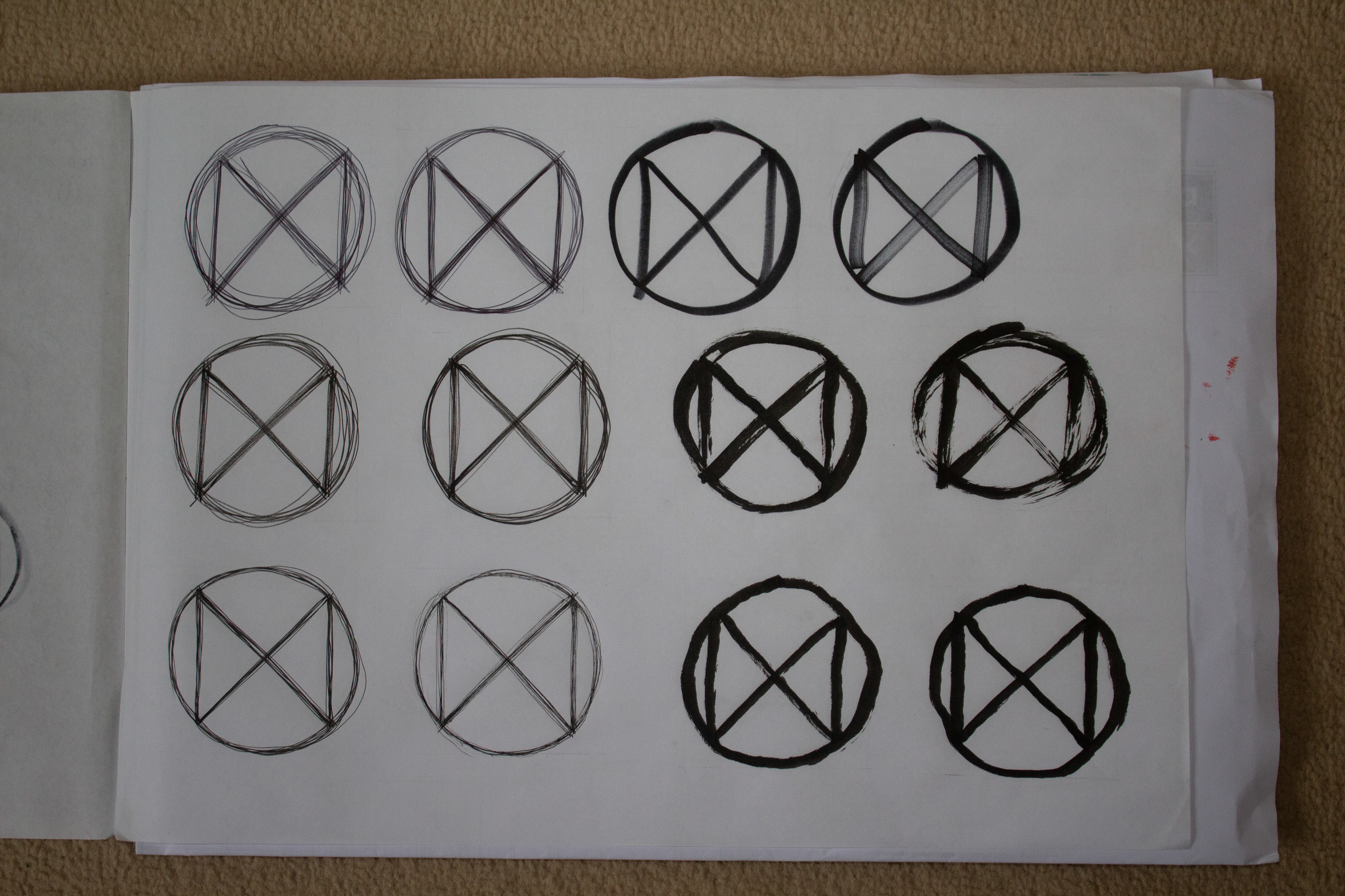
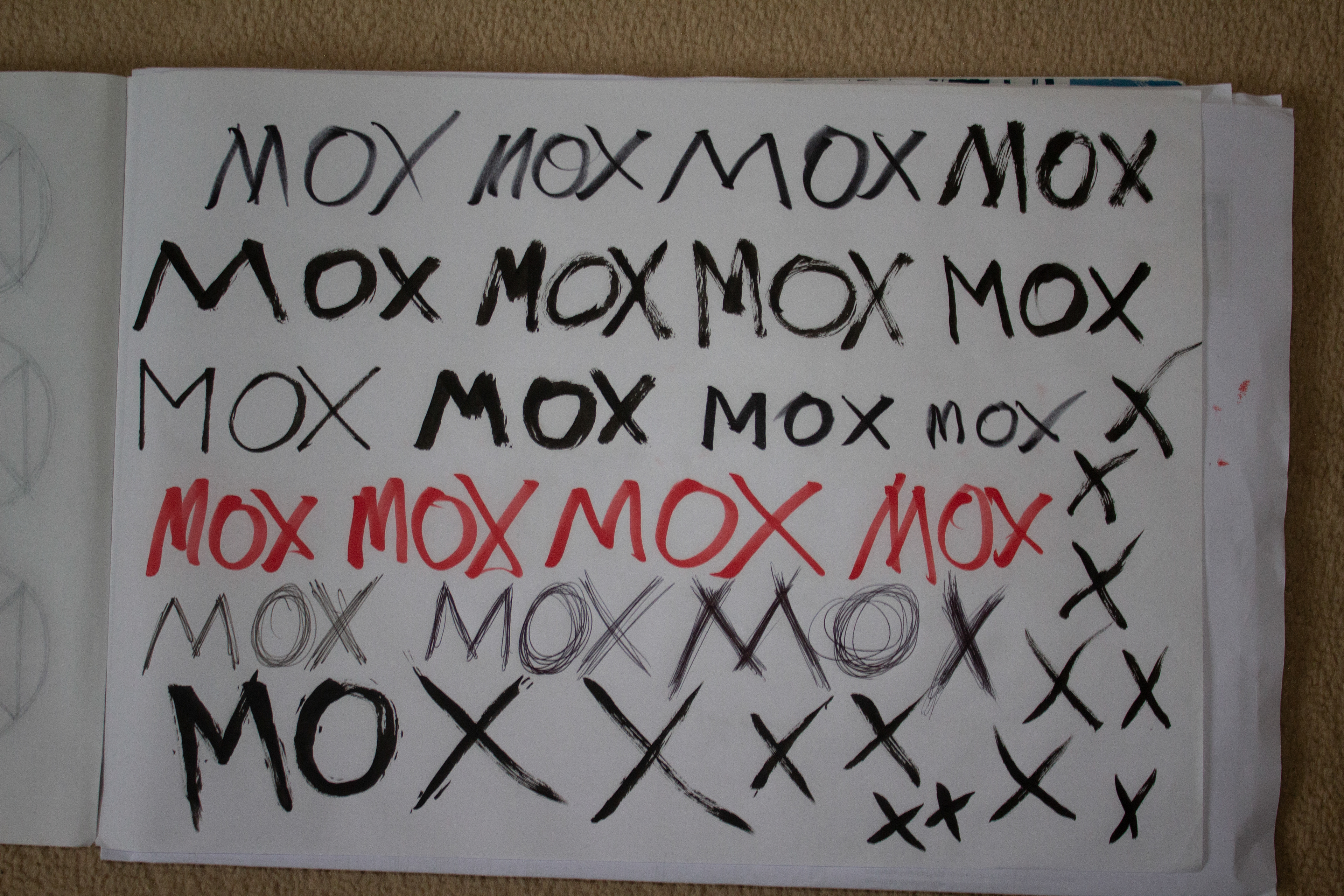
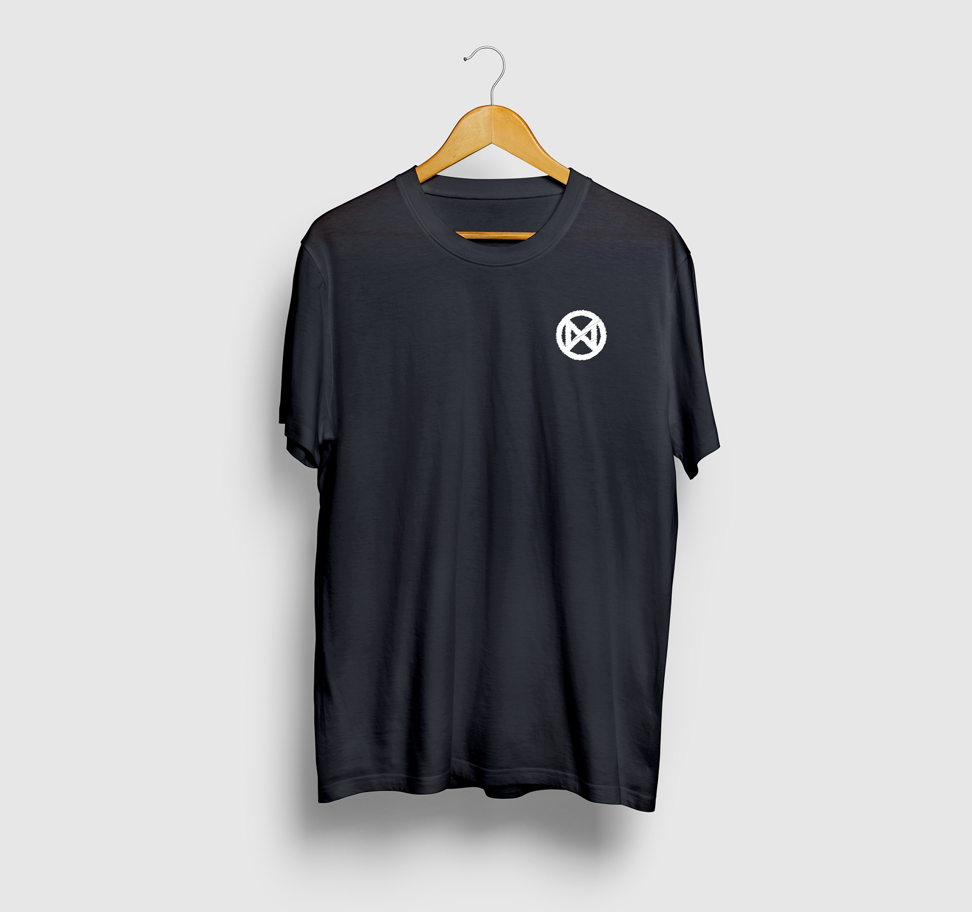
This idea spawned from the icon design New Japan use at the beginning of Moxley's titantron video as well as the video package before his debut in New Japan. I believe this is a very iconic and malleable design that can be the logo for Mox and a corner stone of his merchandise. WWE use a similar method with their superstars and shirt designs, it's something that I think WWE get right in regards of shirts. Create an logo for the wrestler and then iterate on that design over their career creating new merchandise. So here I have taken that approach and created a couple of different iterations of the design already. The initial normal logo is notable as to get across what the symbol is (the letters MOX combined into a symbol) but it doesn't feel a lot like Moxley yet, I then created iterations of a scratched variant and a brush stroke variant, both feel much more like Moxley. The brush variant in particular playing off the DA logo Moxley had as Ambrose in WWE. I also used this brush variant as the base for another design including barbed wire, this was to reference a similar design from Moxley's WWE days as well only here using his trademark orange instead of the red.
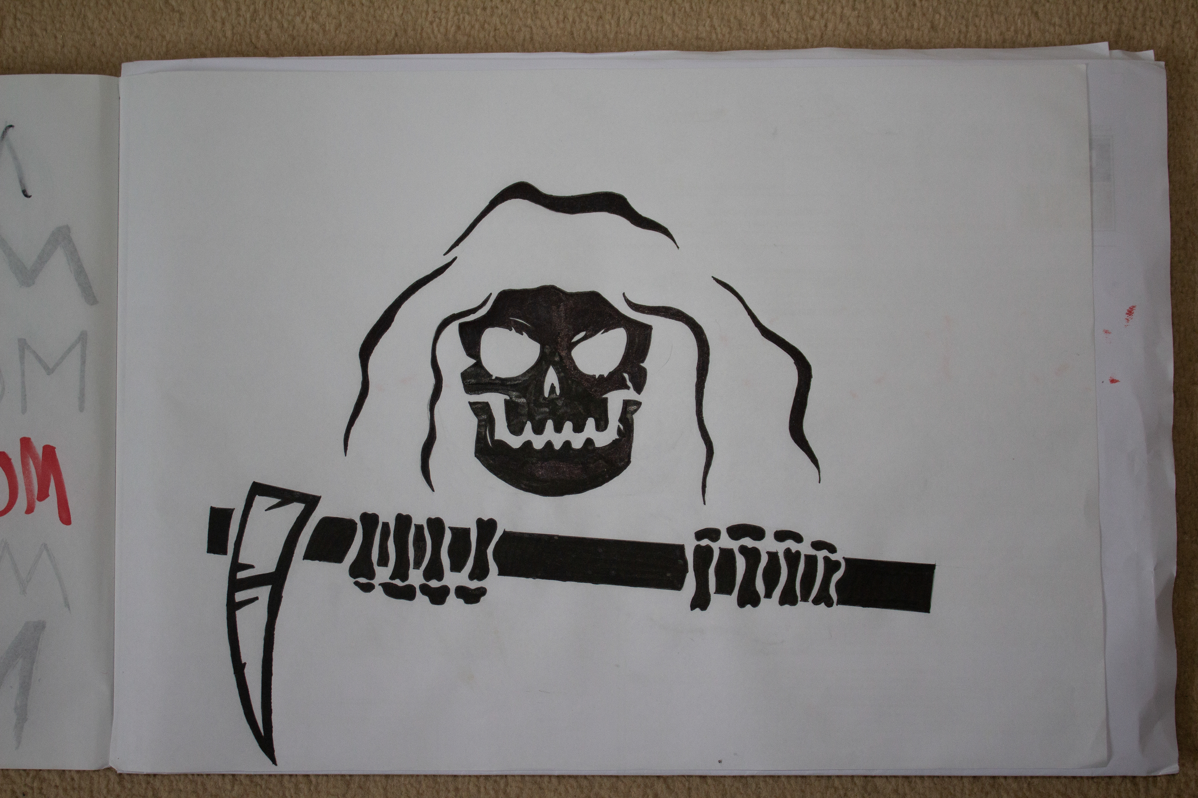
Explicit MOX Violence
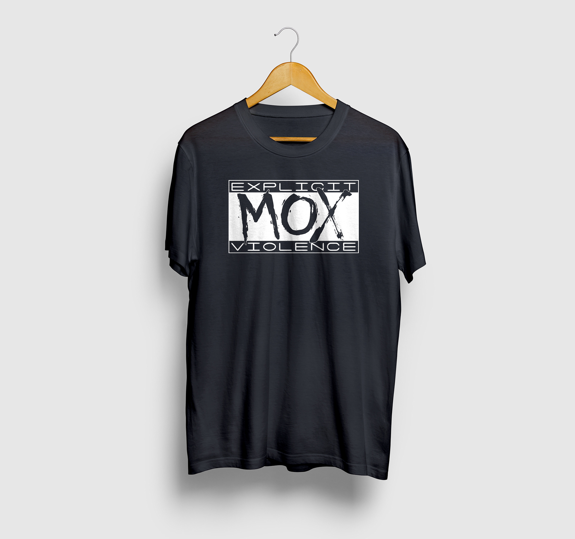
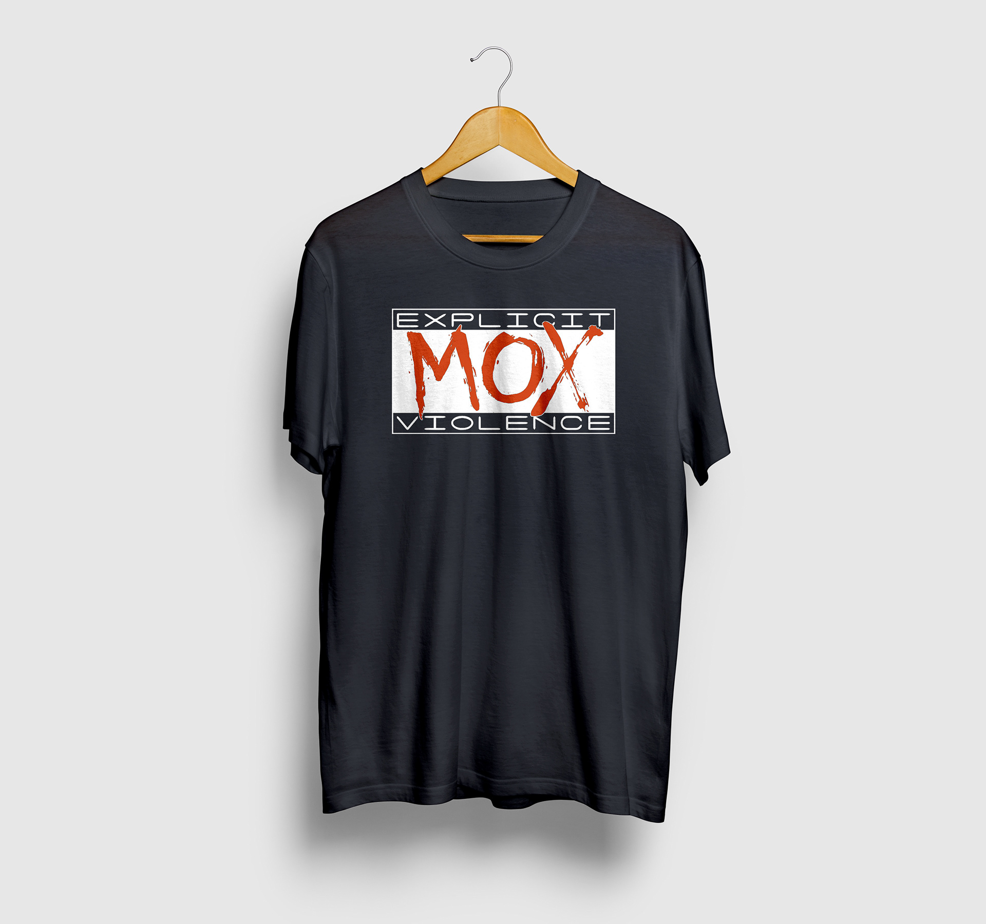
In an attempt to create a design that reflects upon all of Moxley's career while looking into the future, I created a new and updated version of a classic design that has been iterated on by different companies. My twist would be to use a more manic effect that illustrates Moxley's character changes and his attire. When I conceptualised and created this design Moxley didn't have a version of this available. Between me finishing this design and posting it, AEW have released a design that comes from a similar concept. I personally prefer my version, but it is all personal preference.
Paradigm Shift
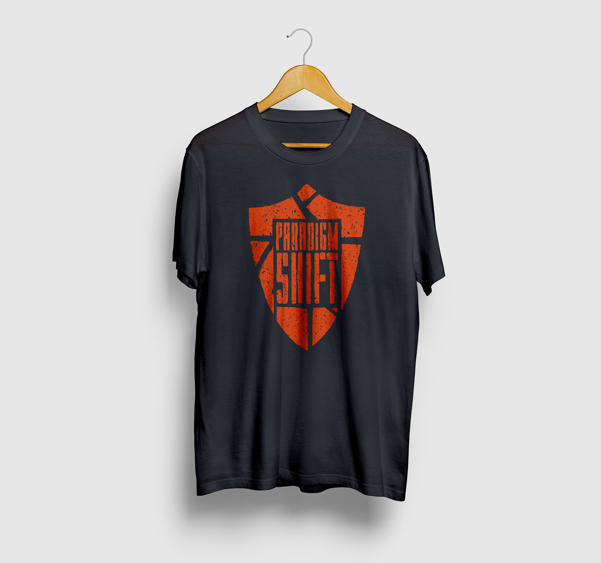
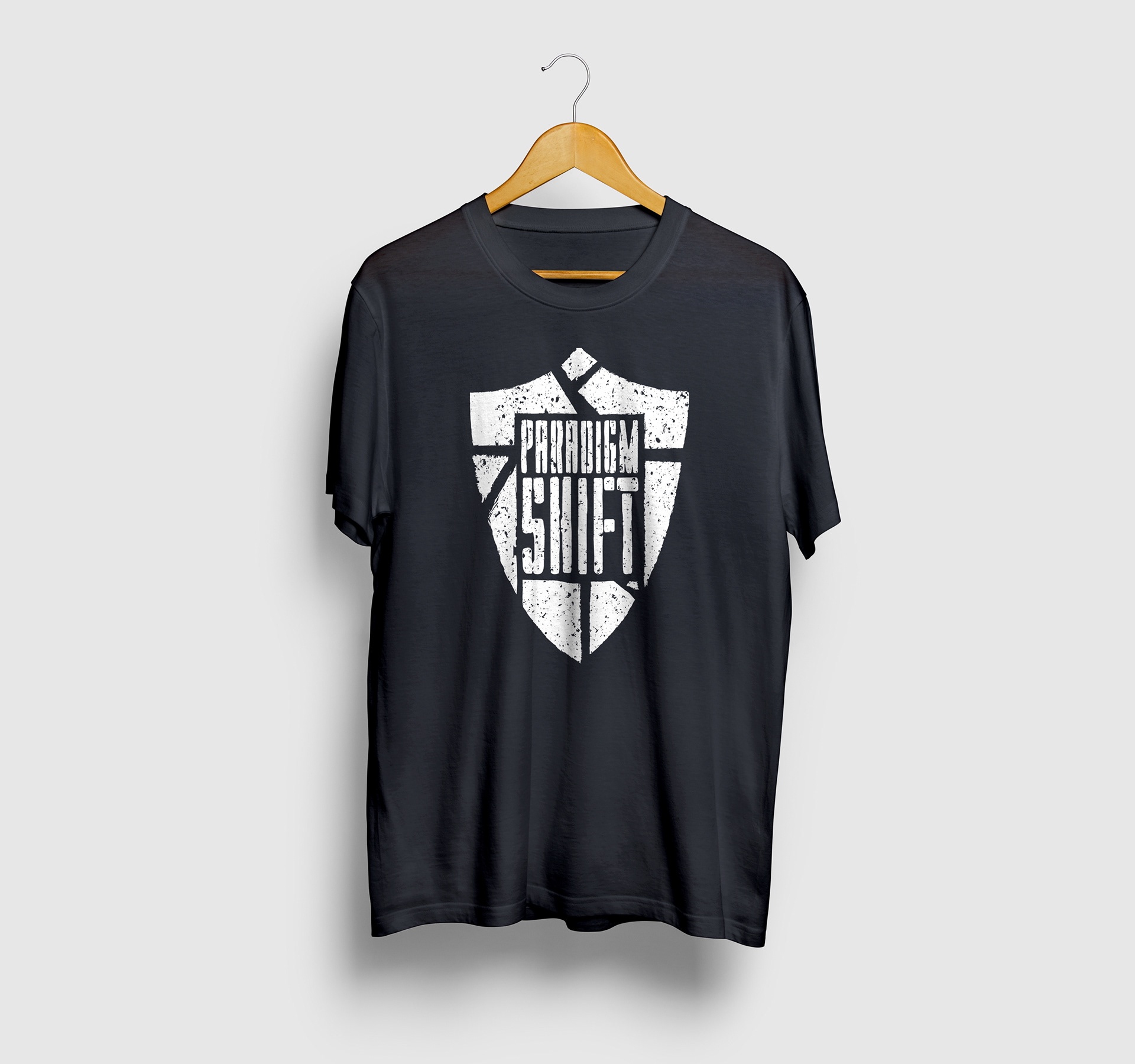
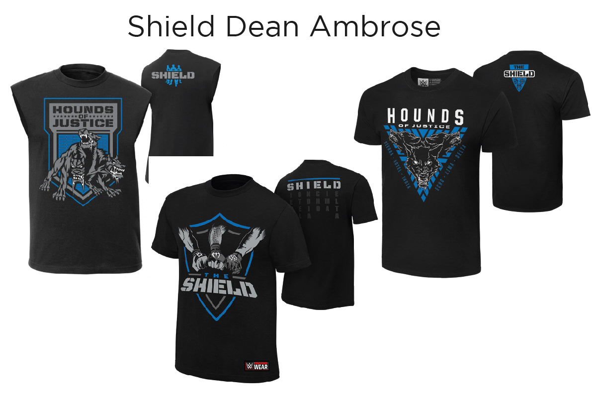
This would be an AEW design as they use the 'Paradigm Shift' name. As such, I thought a design that cheekily digs at WWE and specifically Moxley's time there, fits within AEW's mentality so far. So here I decided to use the image of a broken shield to indicate the paradigm shift in Moxley's career. The shape of the shield is a direct reference to the newer and most recognisable Shield shirt that Moxley wore at the tail end of his tenure at WWE.
Death Rider
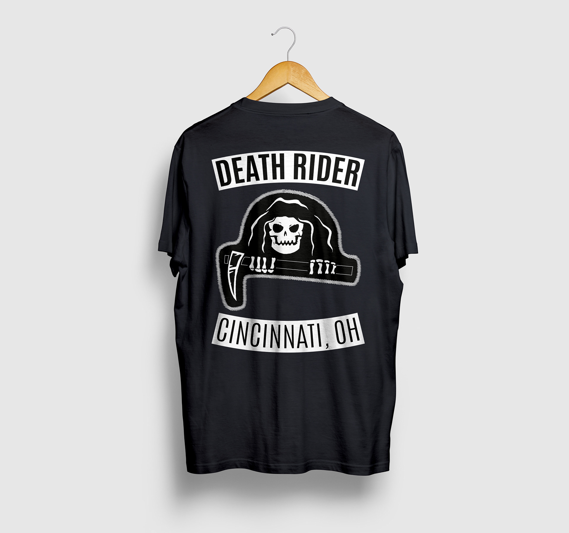
This design is aimed at New Japan's version of Moxley, where they used a lot of Motorcycle gang motifs inside his nickname and jacket that was used within their video packages. I wanted to create a design that leaned into the motorcycle gang and felt authentic to that. I did some research into motorcycle gang jackets and based my design around that. I think this design could easily be used in a hoody format or an actual jacket, if they would want to create more expensive goods.
If you read this far sincerely thank you, I'm @oliverkidsleydesign on Instagram if anyone is interested but I would love to hear your thoughts on these designs or just wrestling shirt designs in general.