Key Art & Blu-Ray Packaging
Subject: 'Blade Runner 2049'
Aim: To create new key art for posters and Blu-ray packaging
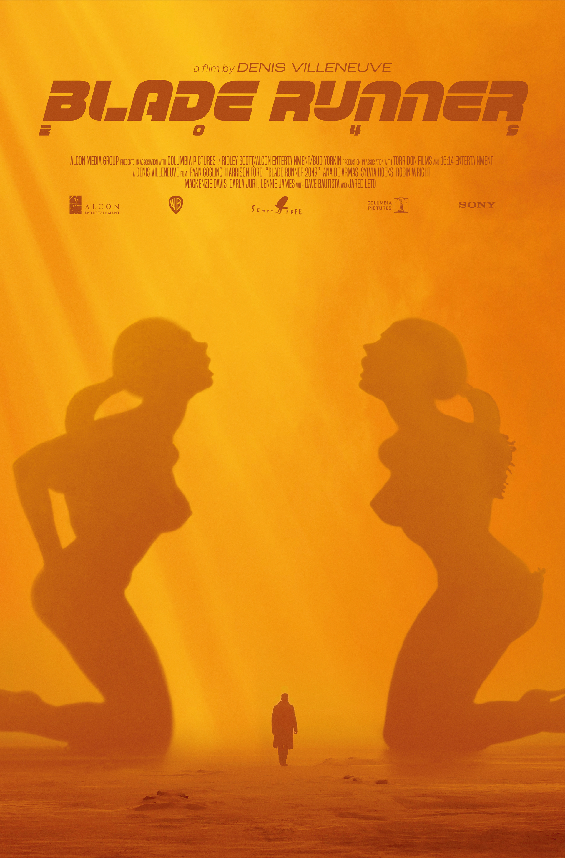
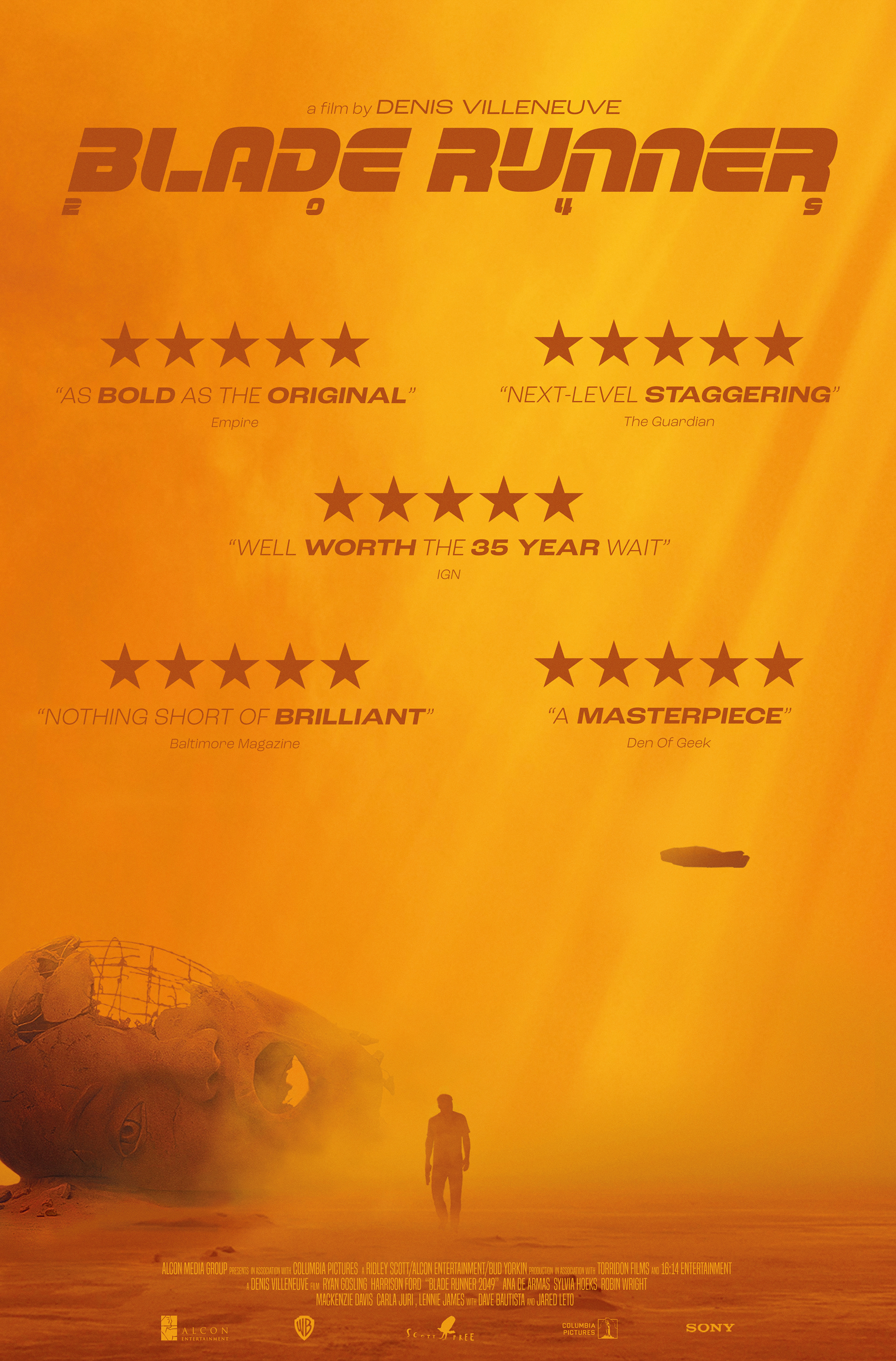
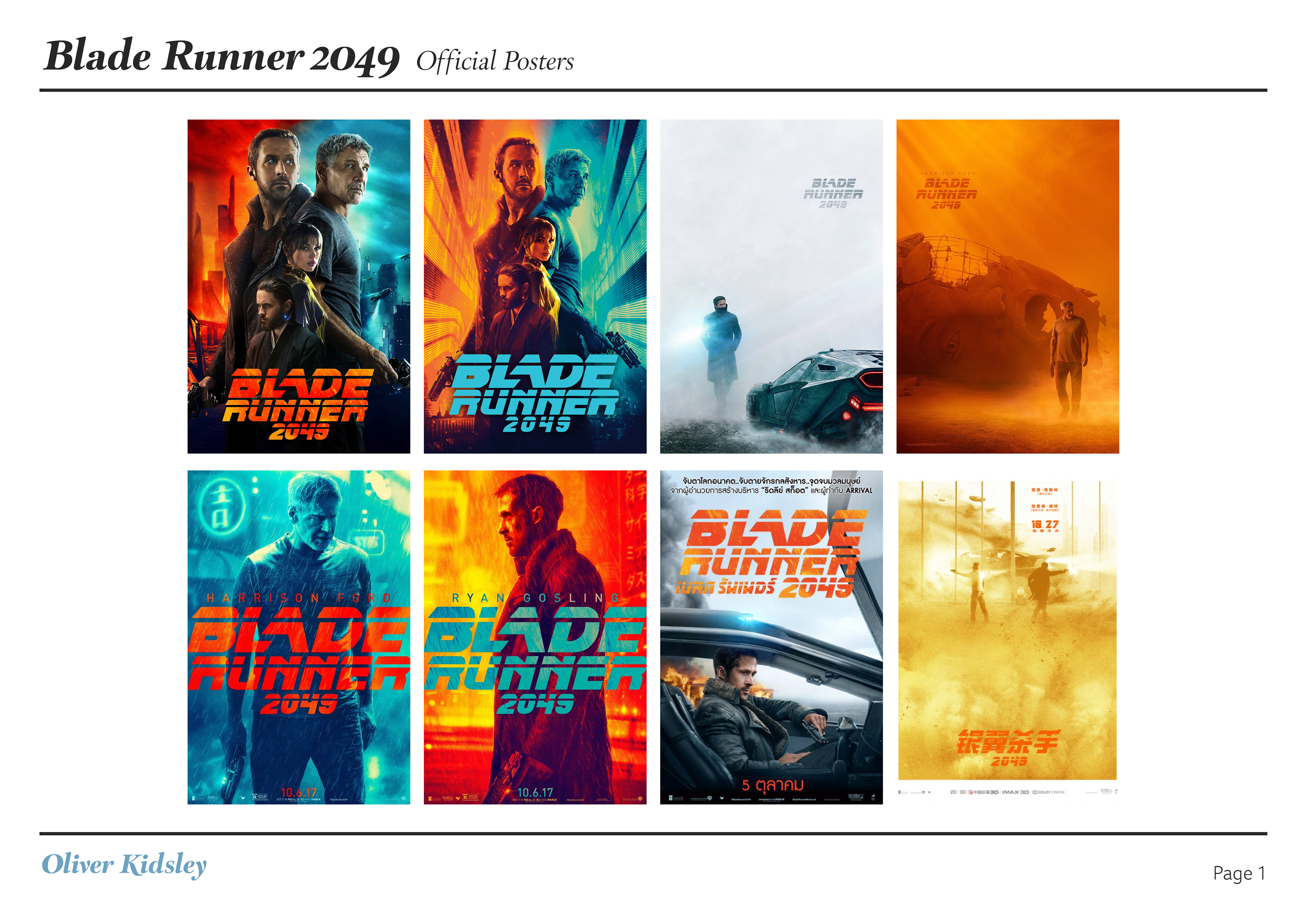
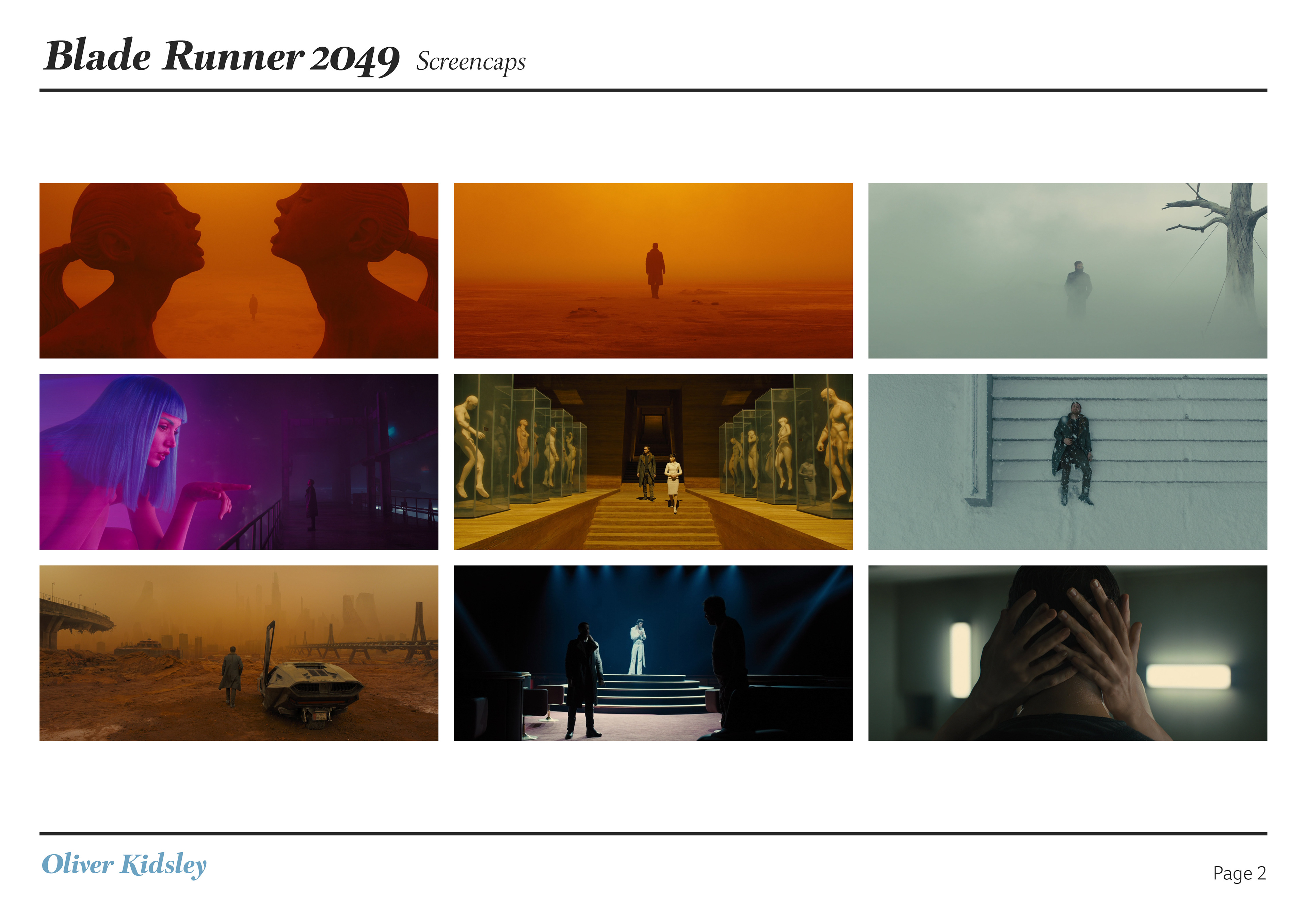
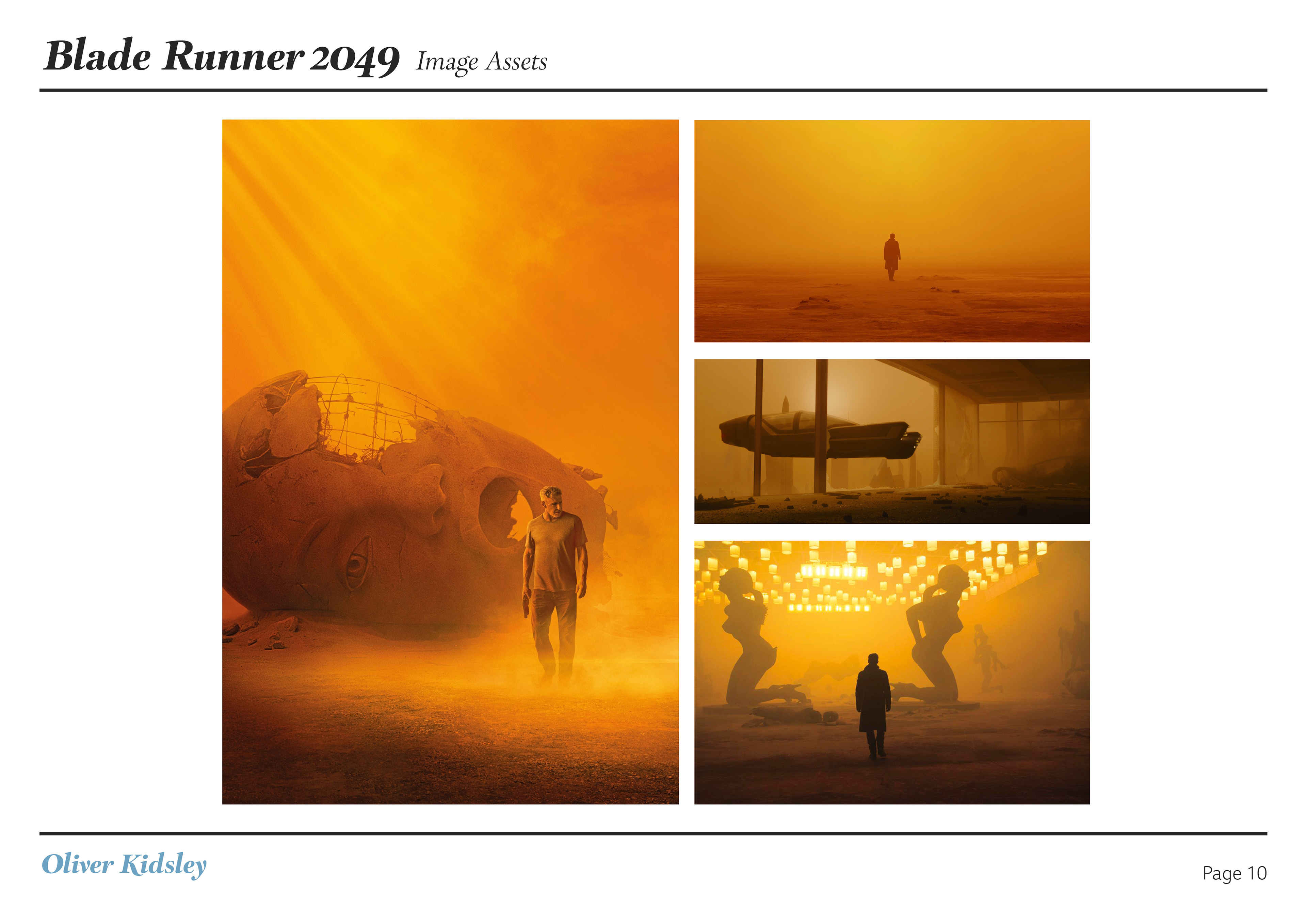
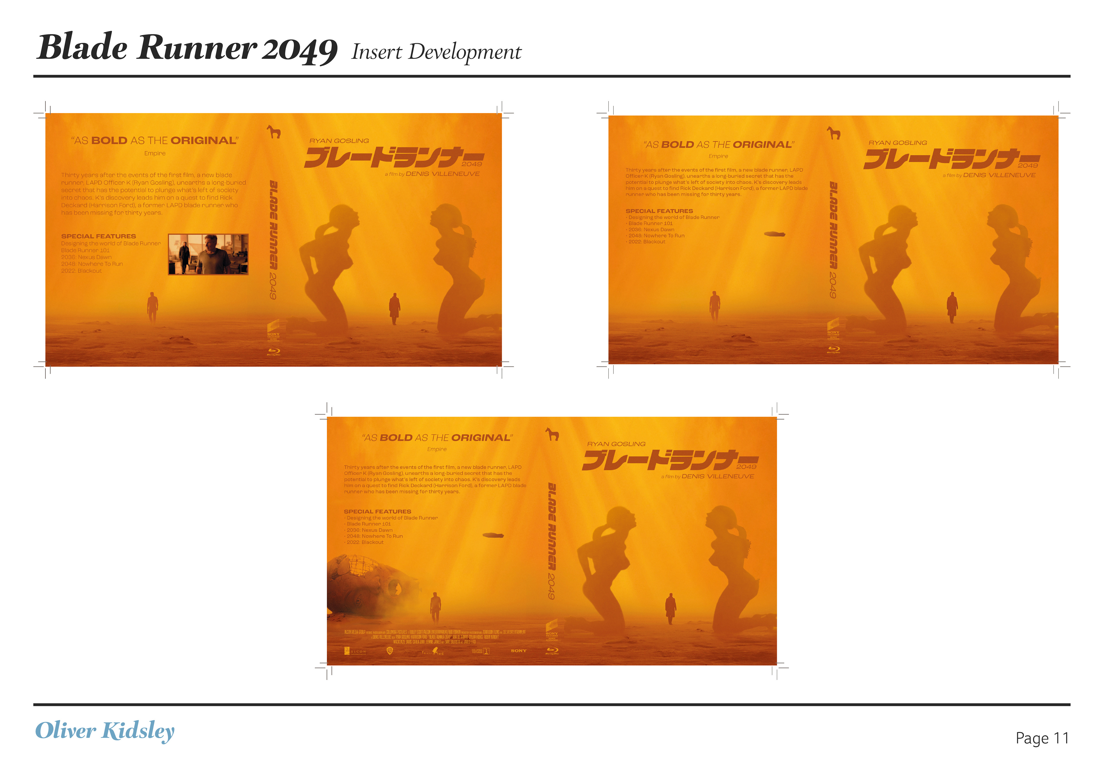
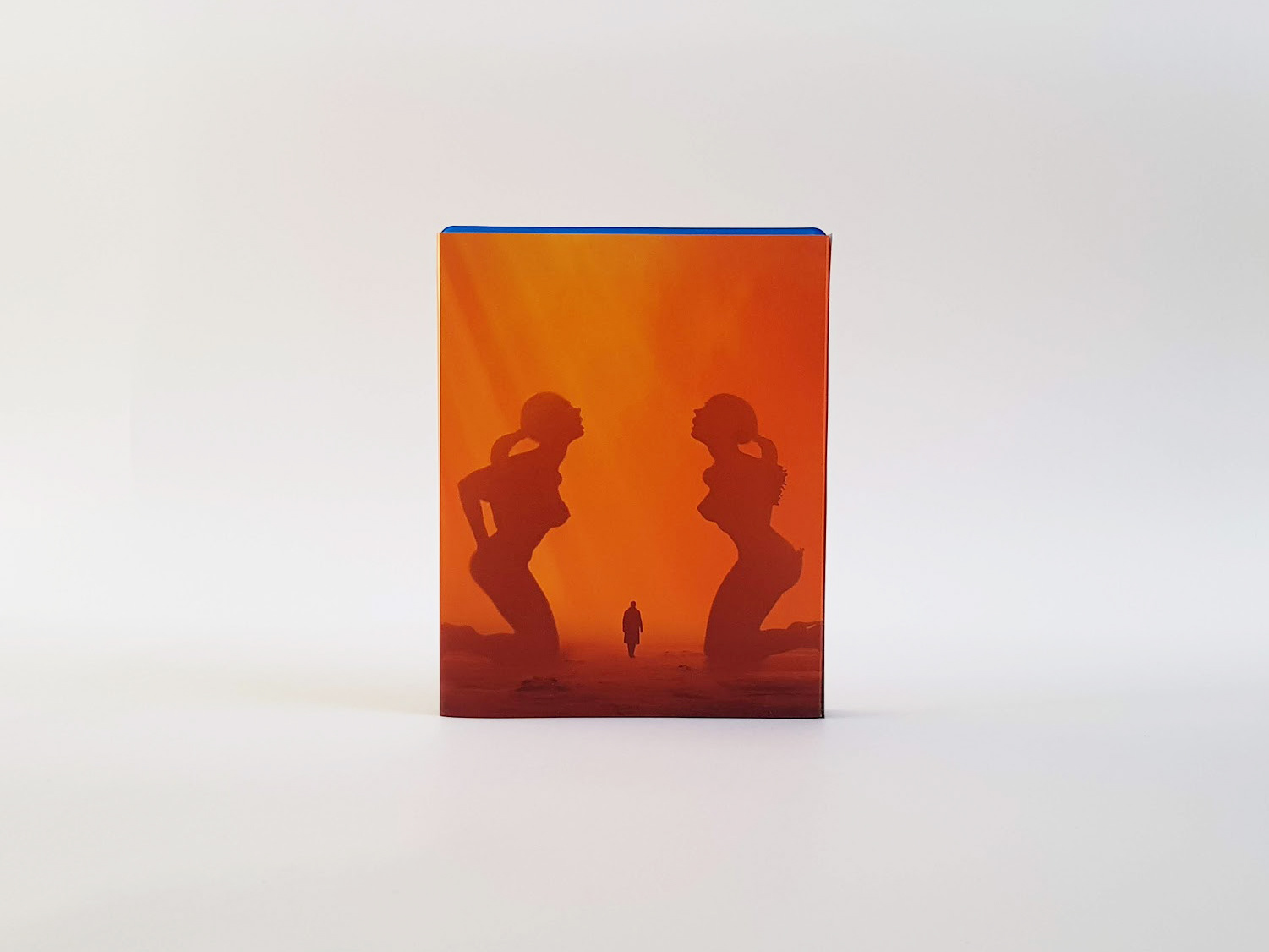
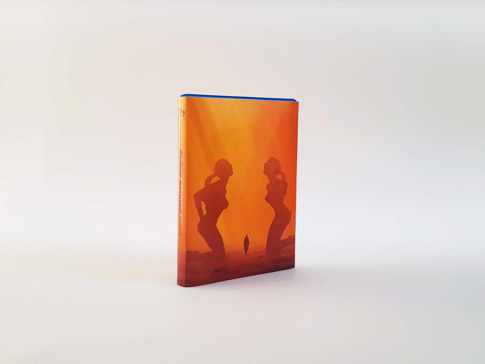
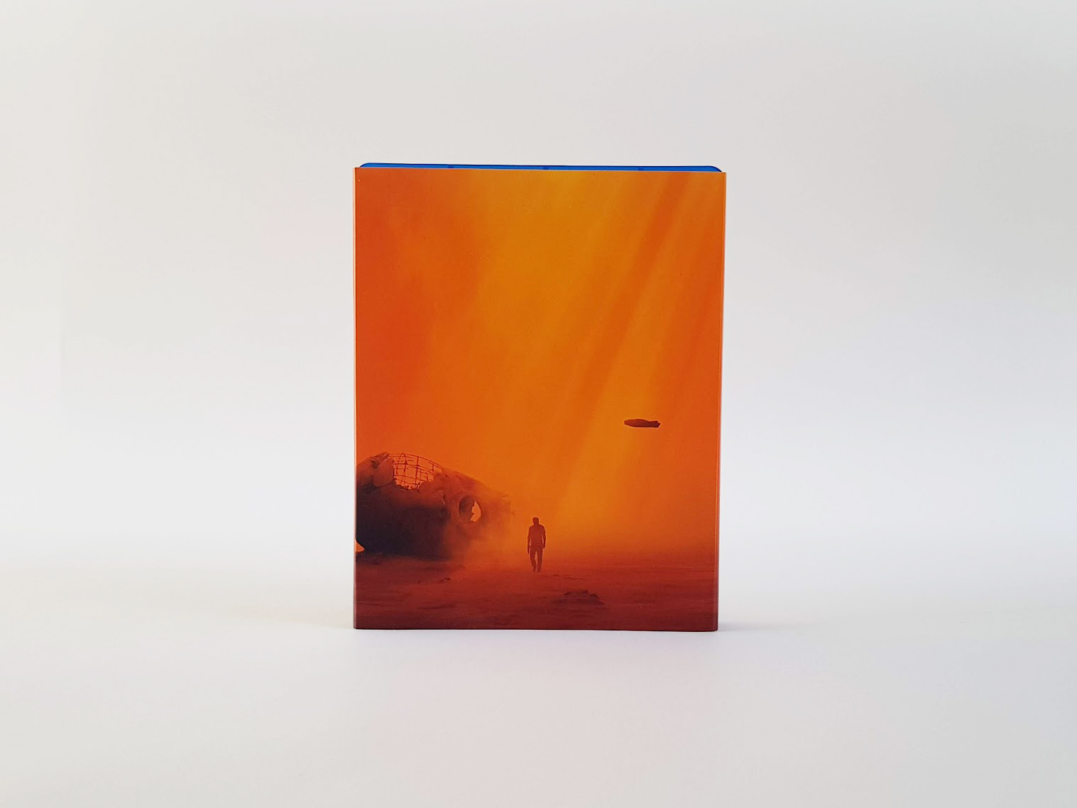
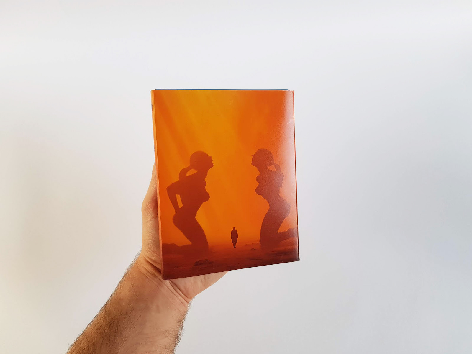
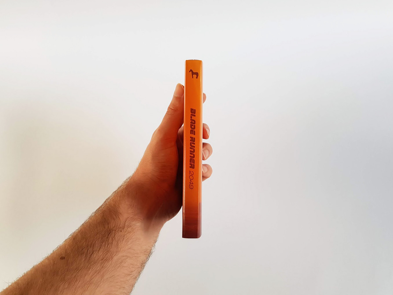
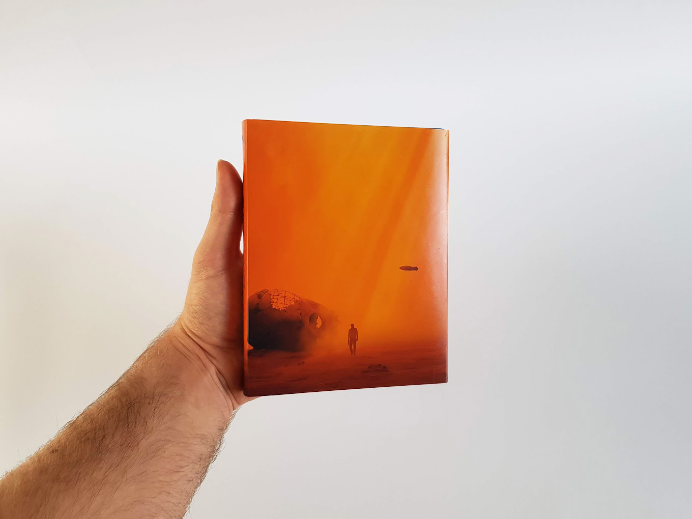
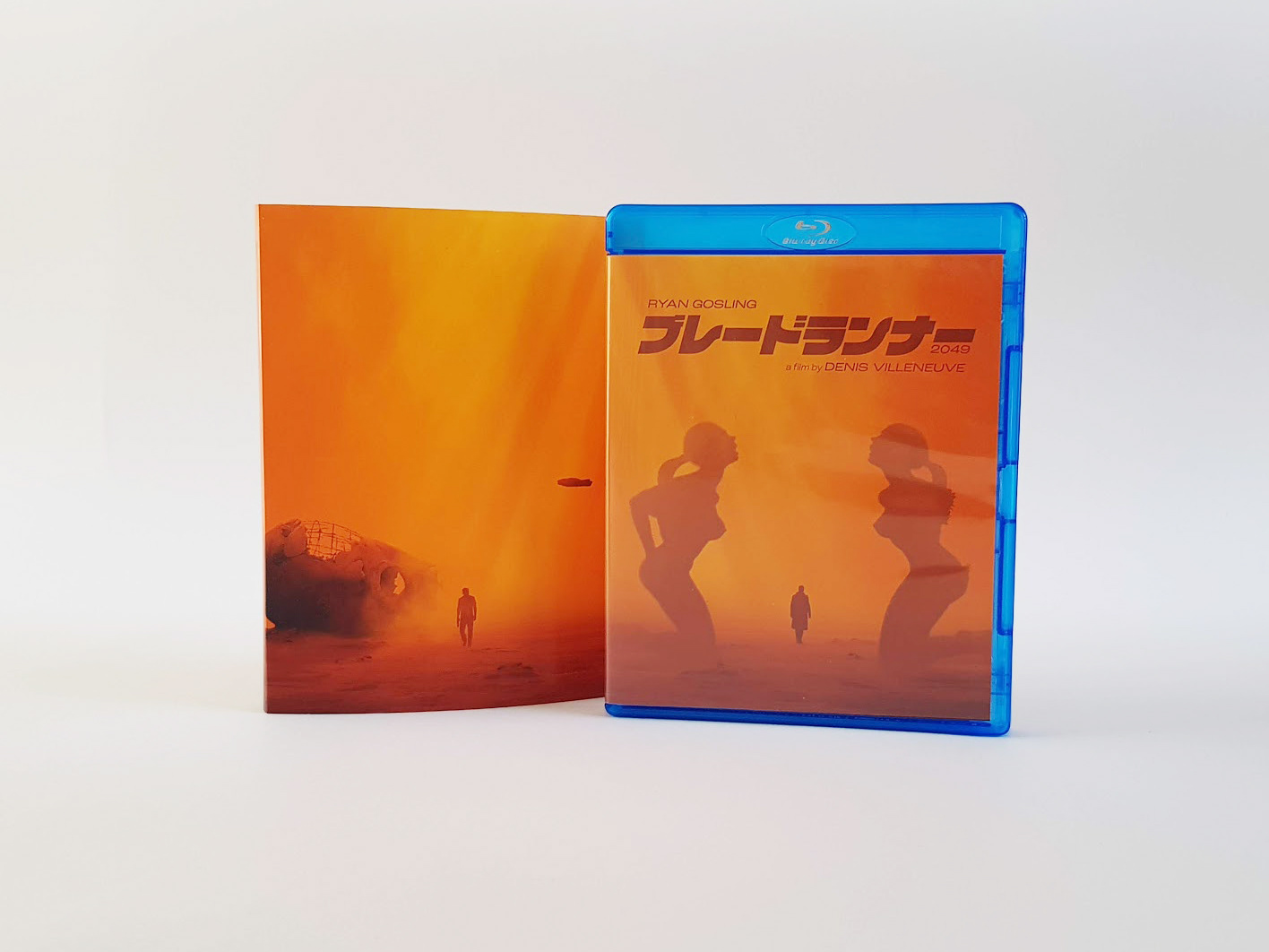
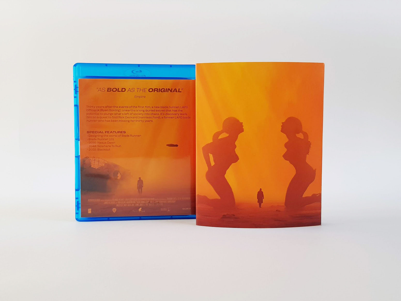
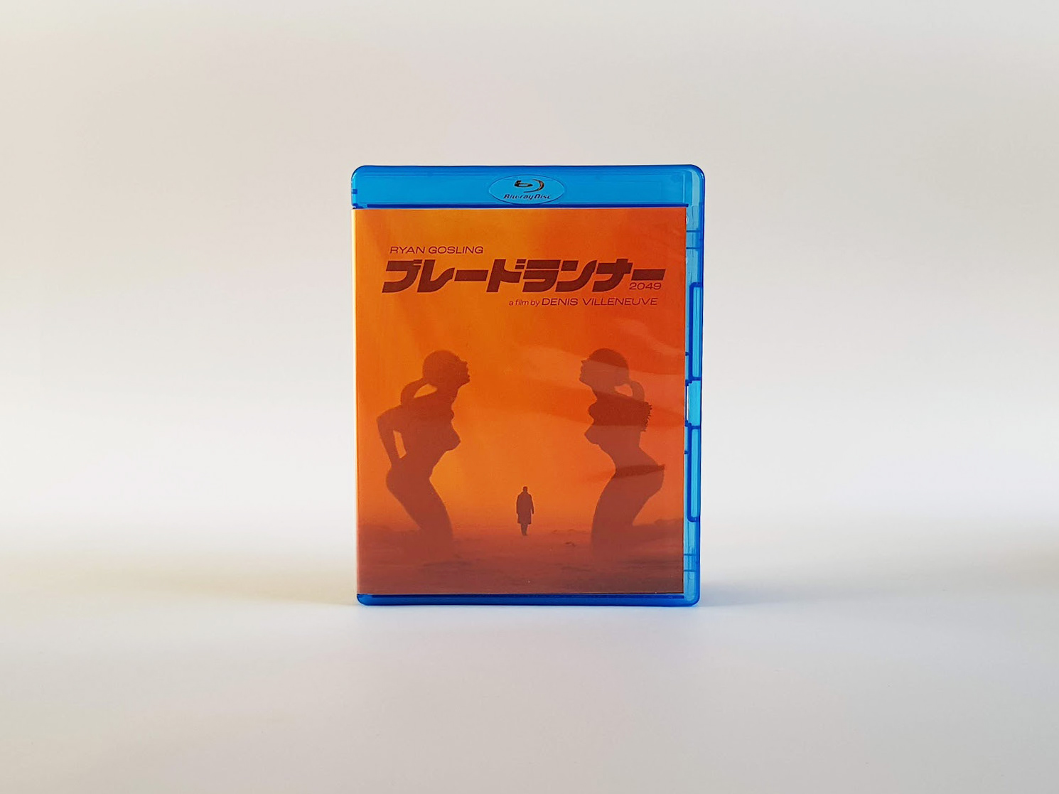
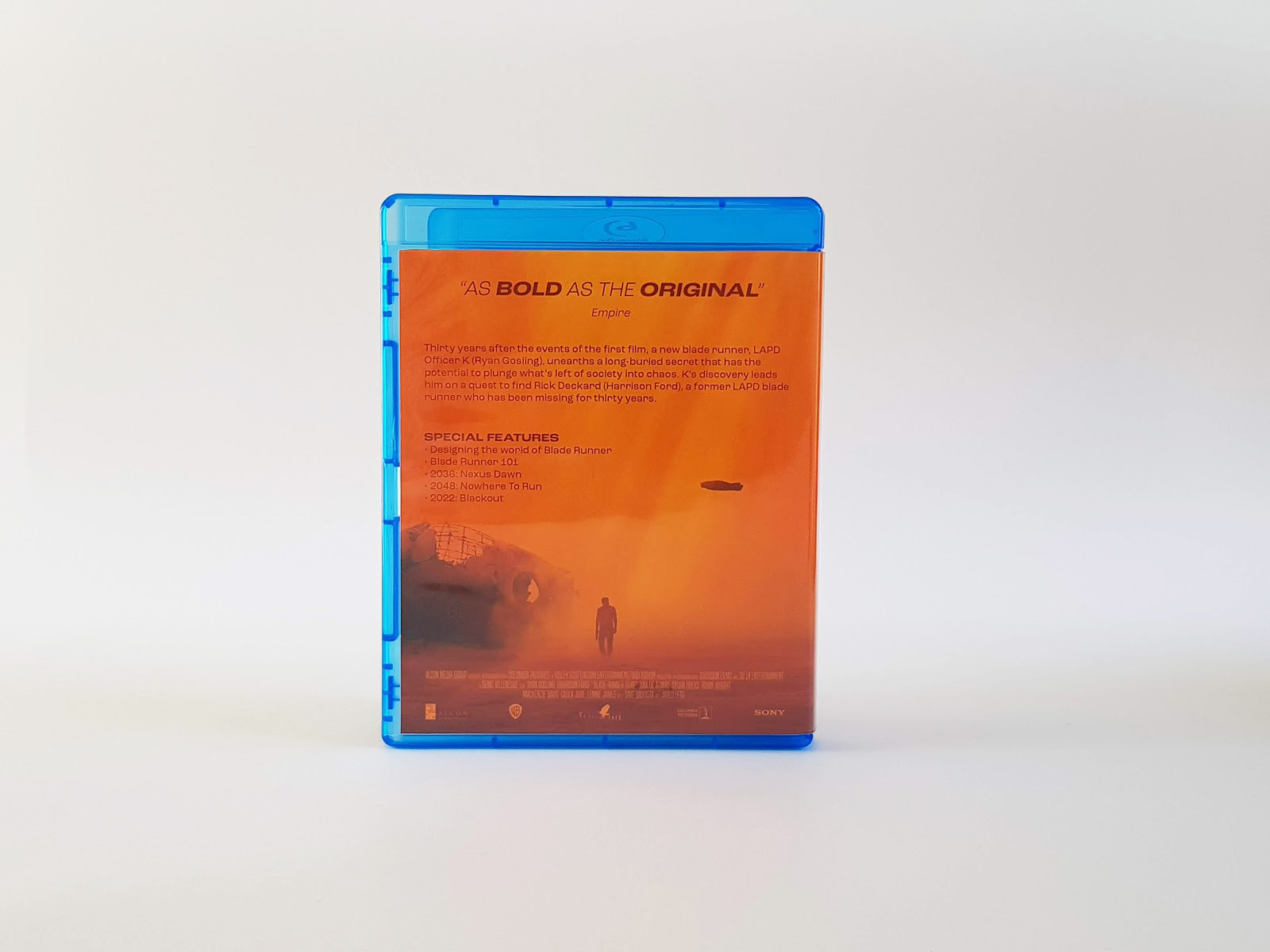
One of my favourite films of all time, Blade Runner 2049, had a poster and Blu-Ray packaging that I personally didn't enjoy. I decided to create my own using the Las Vegas scene and the cinematography of Roger Deakins as inspiration. This part of the film is my favourite visuals in any film, and as such I felt that the cinematography of the film was a better advertisement for the film than the actual advertising. I felt that this design correctly portrayed the scope and the tone of the film so eloquently rather than the official key art design. The main poster/front of packaging shows Officer K walking through the wasteland with the two mirrored statues, this shot is never actually seen in the film this way, but with the masterful way the film is shot, you can clearly tell the geography of the scene and where these statues are placed. This is one of my more favourite types of poster, such designs like La La Land, or The End OF Evangelion, have similar situations, of showing complete shots that encapsulate the tone and emotional brevity of the film using a shot from the film, or a shot from a different angle not seen in the film proper. These are iconic images that immediately invoke the same feeling you get from the film, that is the type of feeling I tried to capture with my design. The secondary poster/back of the packaging shows Rick Deckard walking the opposite direction with a decapitated statue head behind him, while the car from the end of their time in Las Vegas flies by. This is not something that happens in the film, but I wanted to create a mirrored piece to the main poster using Harrison Ford as he is the returning actor to the sequel, I also wanted to create this for the packaging more specifically as it would be poetry in comparison to the front.
Research & Development



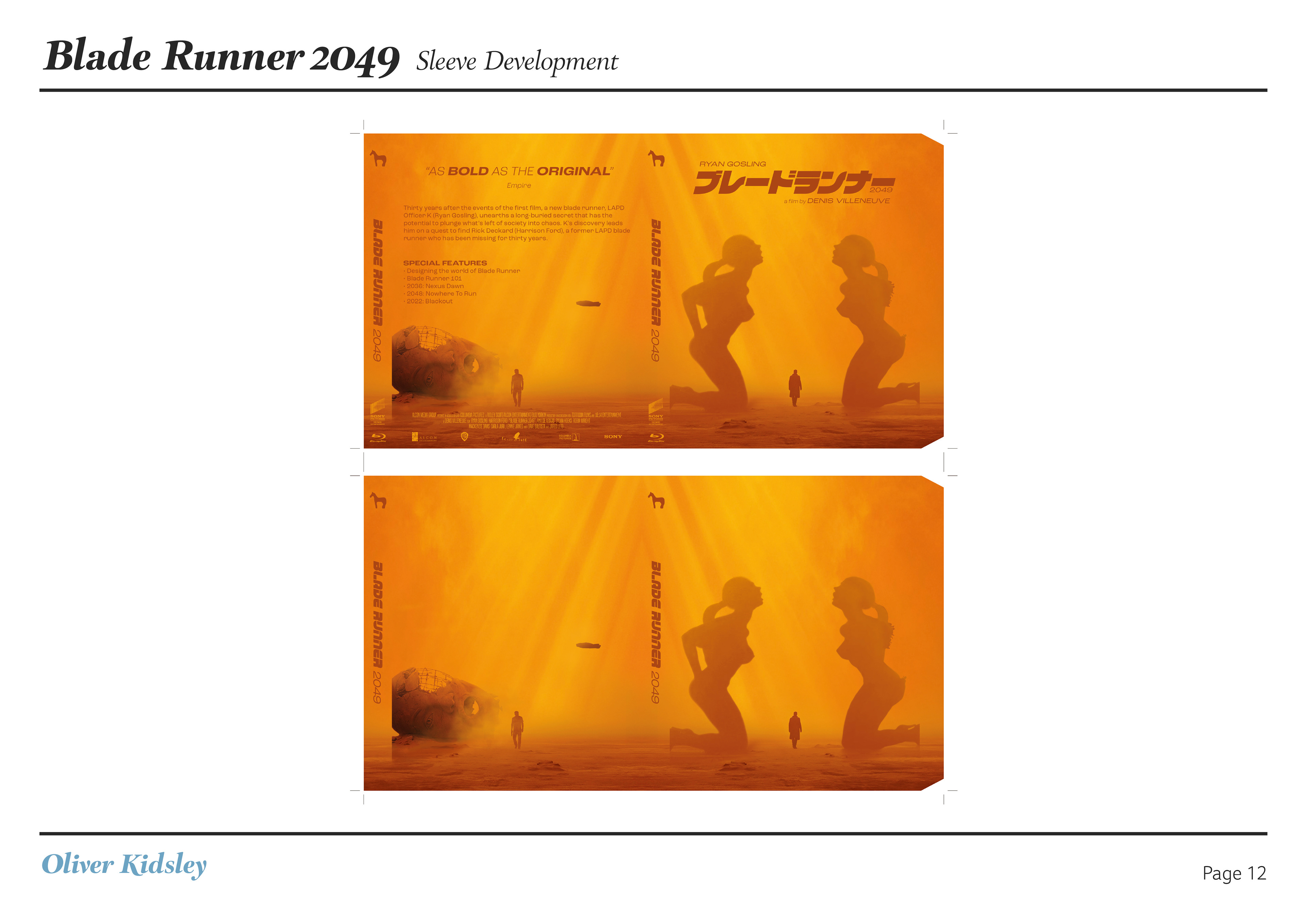
Final Pieces
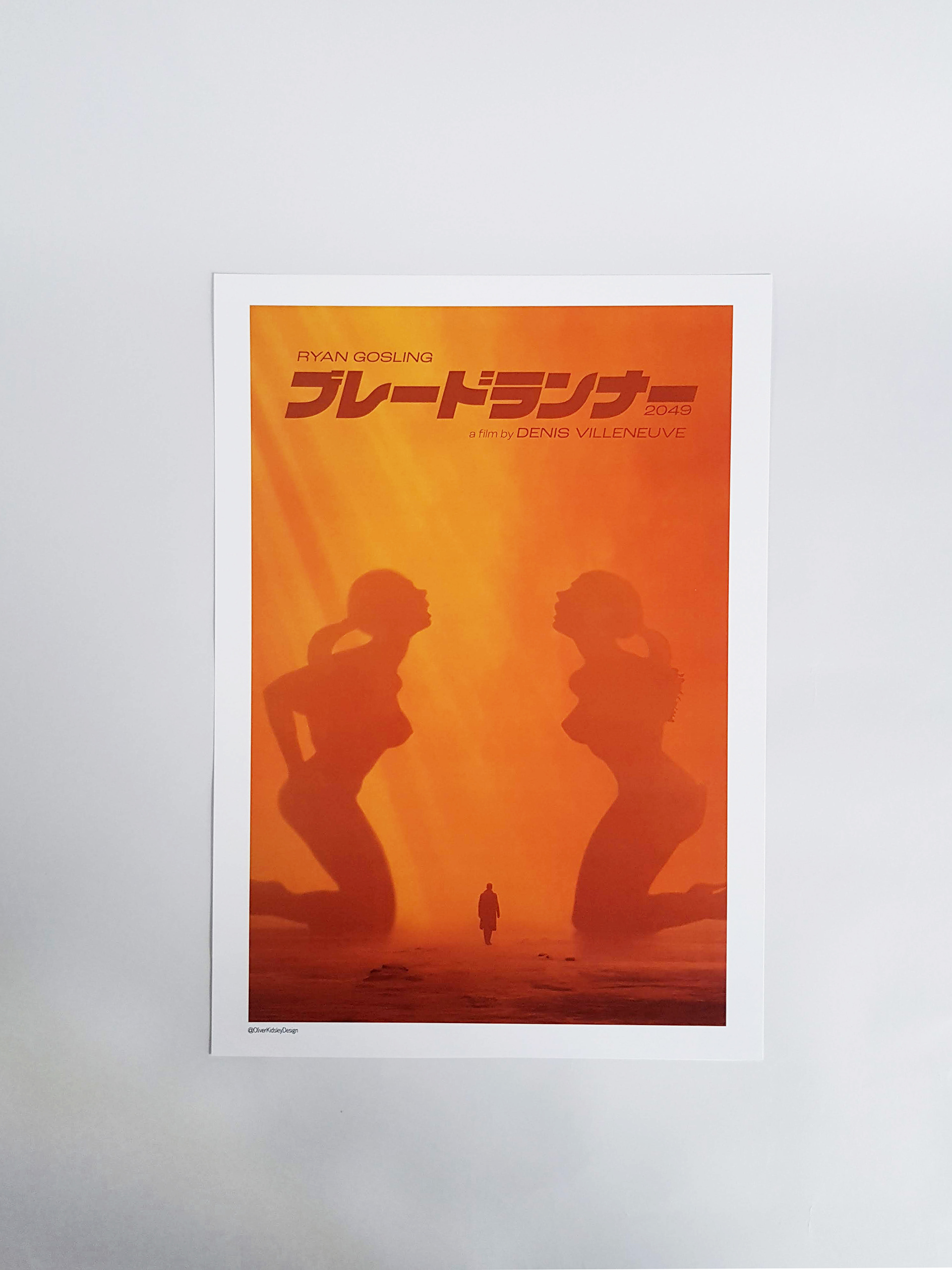
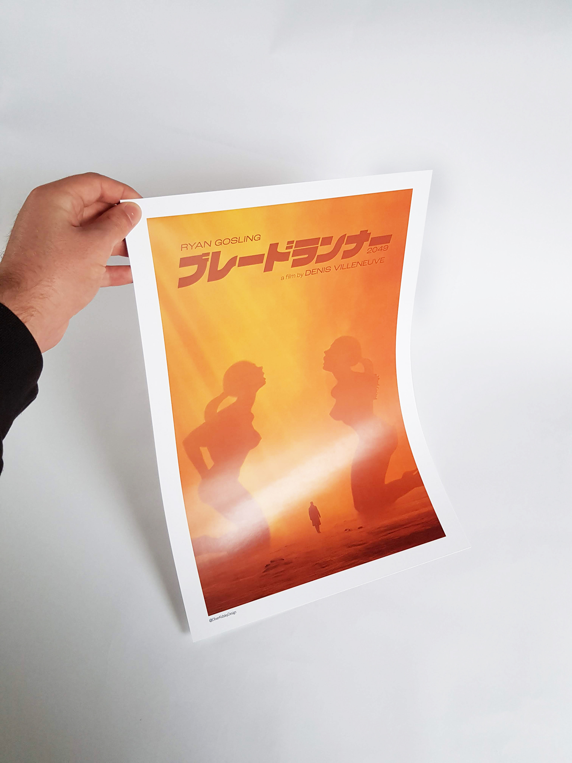
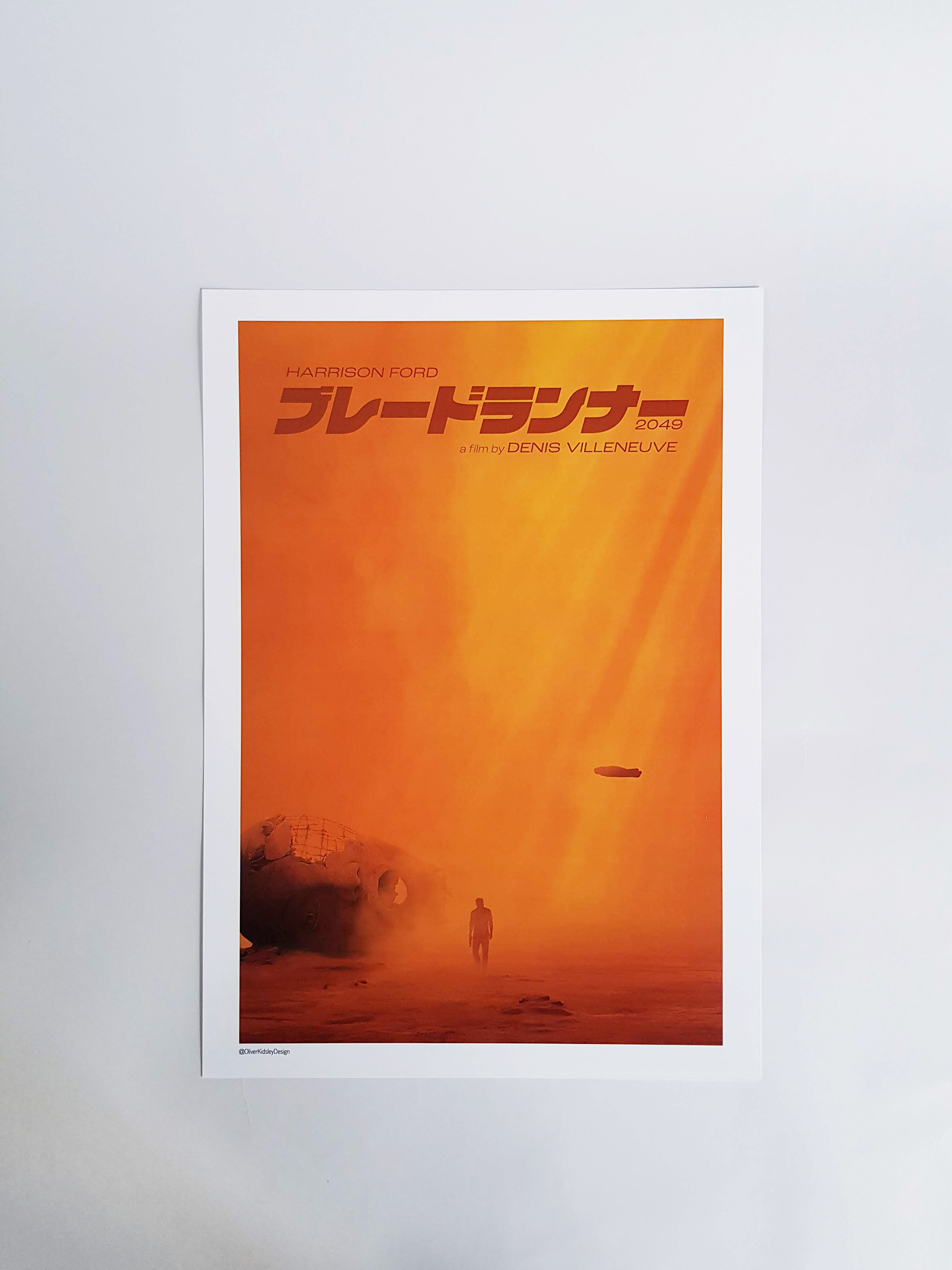


1-Sheet, Quad, Bus T-Side & 12 Sheet
Subject: 'Blade Runner 2049'
Aim: To take my key art design and expand it into more advertising
Aim: To take my key art design and expand it into more advertising
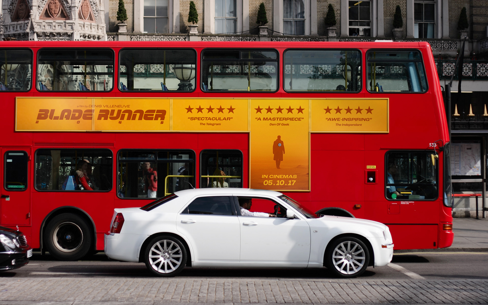
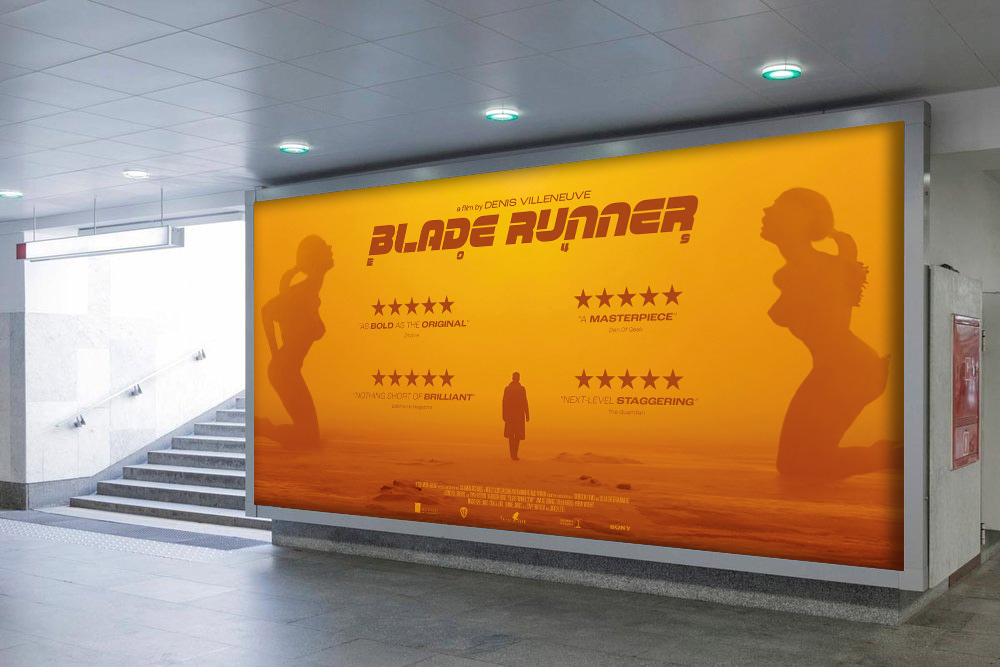
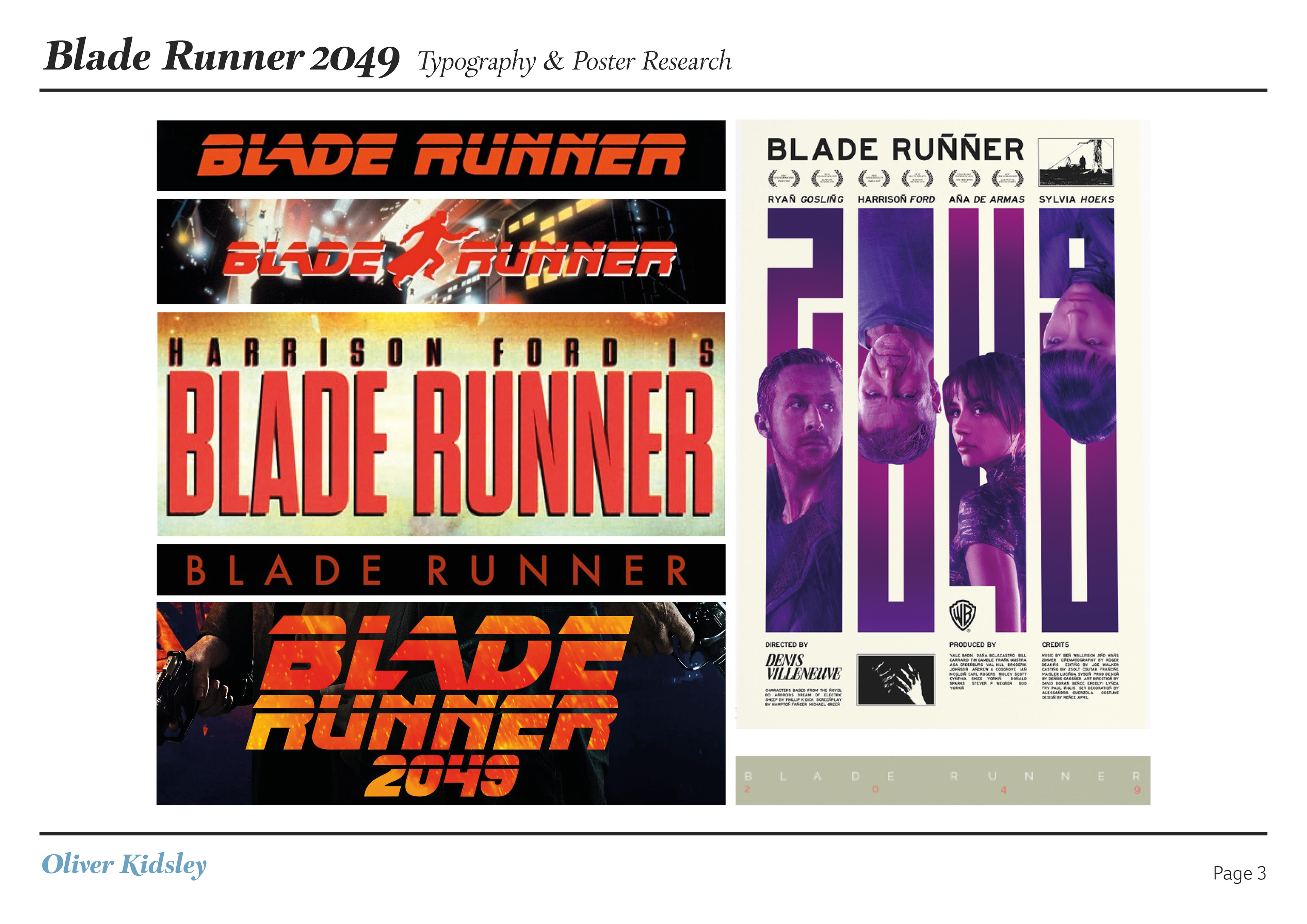
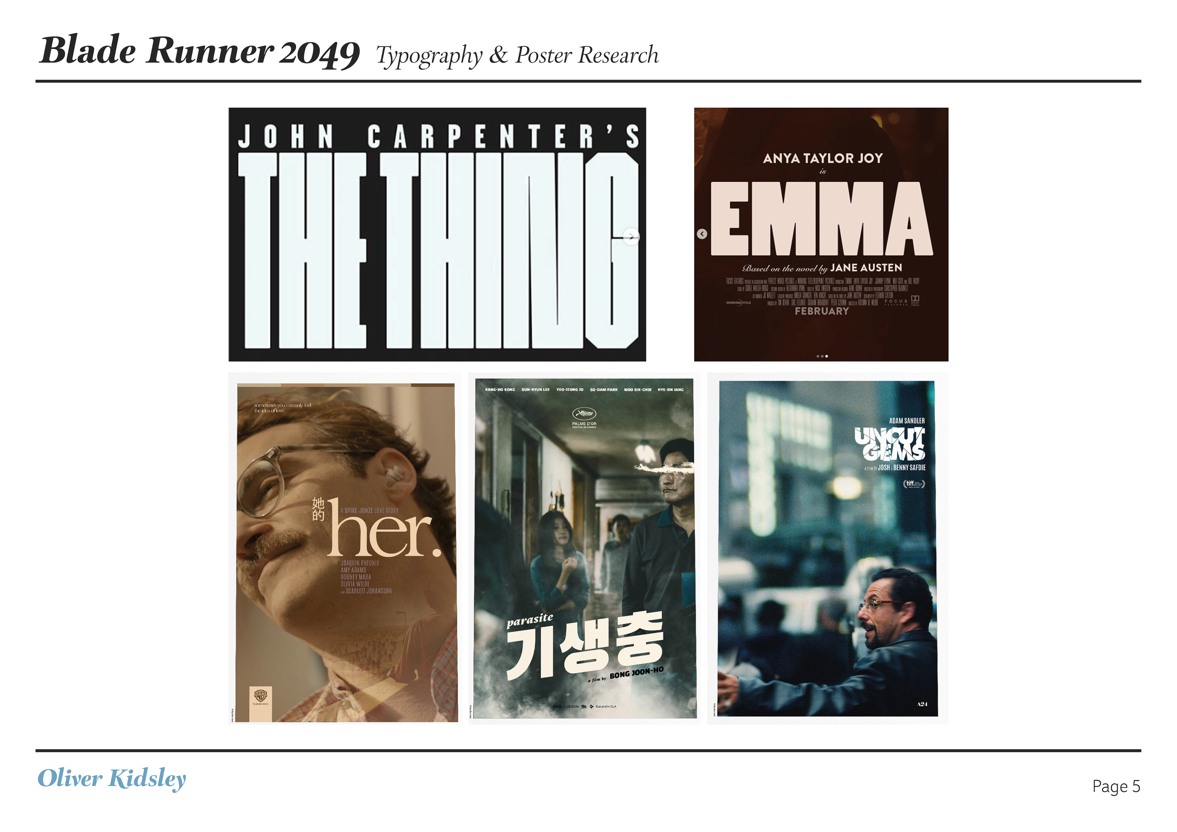
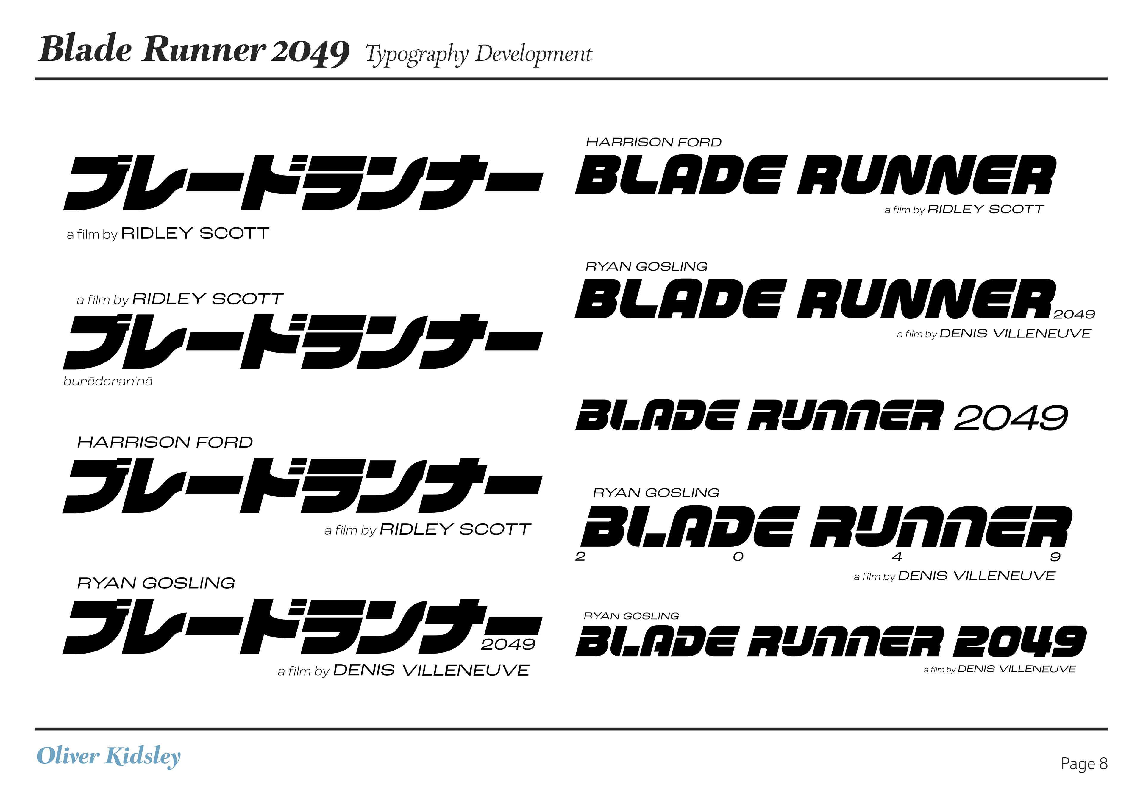
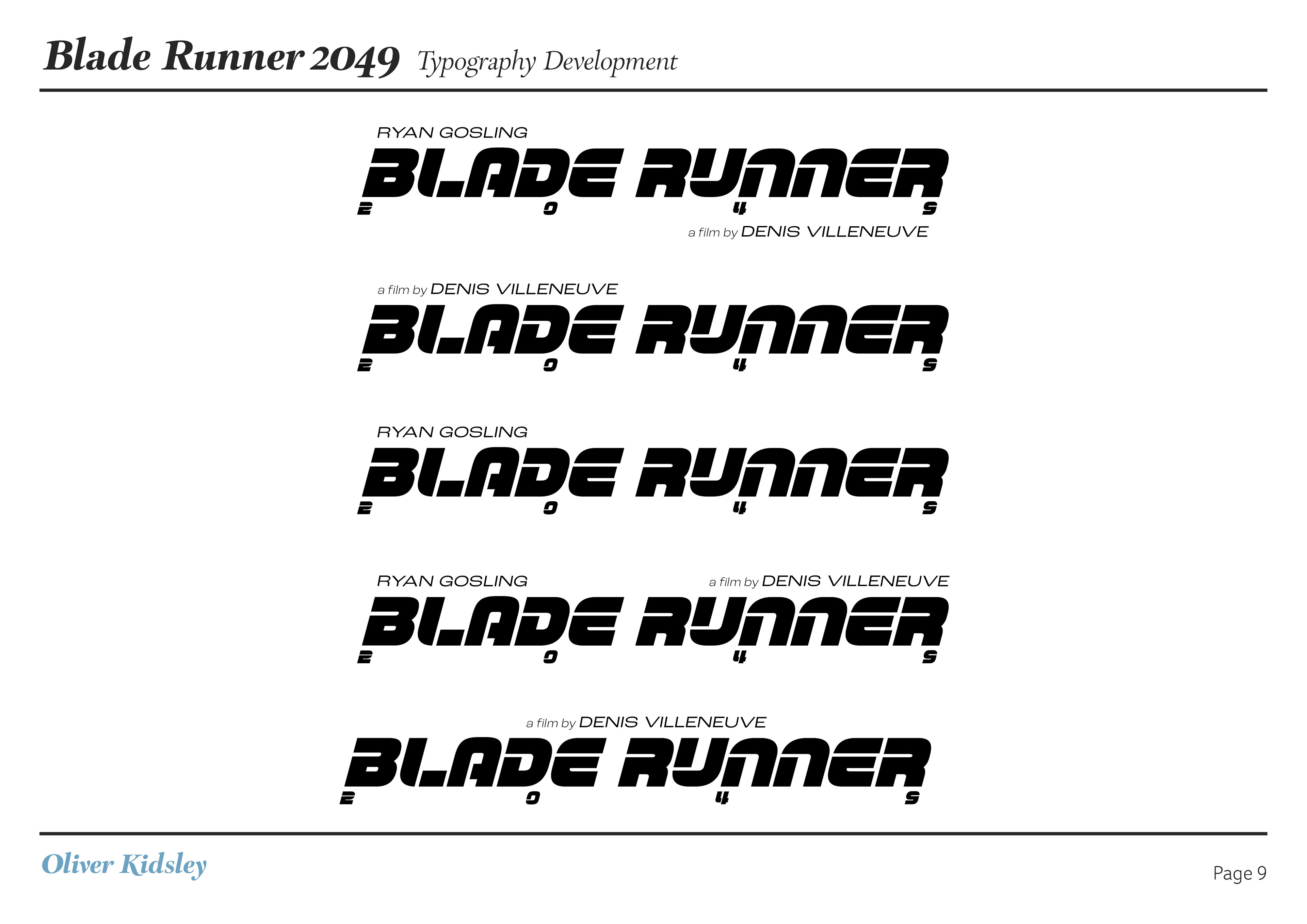
I wanted to take my original poster, which I made with more of a minimalistic style and using the Japanese typography for stylistic reason, and turn it into more of an official release, that meant redesigning the logo and typography for the design to work with 1-Sheets, Quads, T-Side and 12 Sheet formats.
