Key Art Posters
Subject: 'Beyond The Mat'
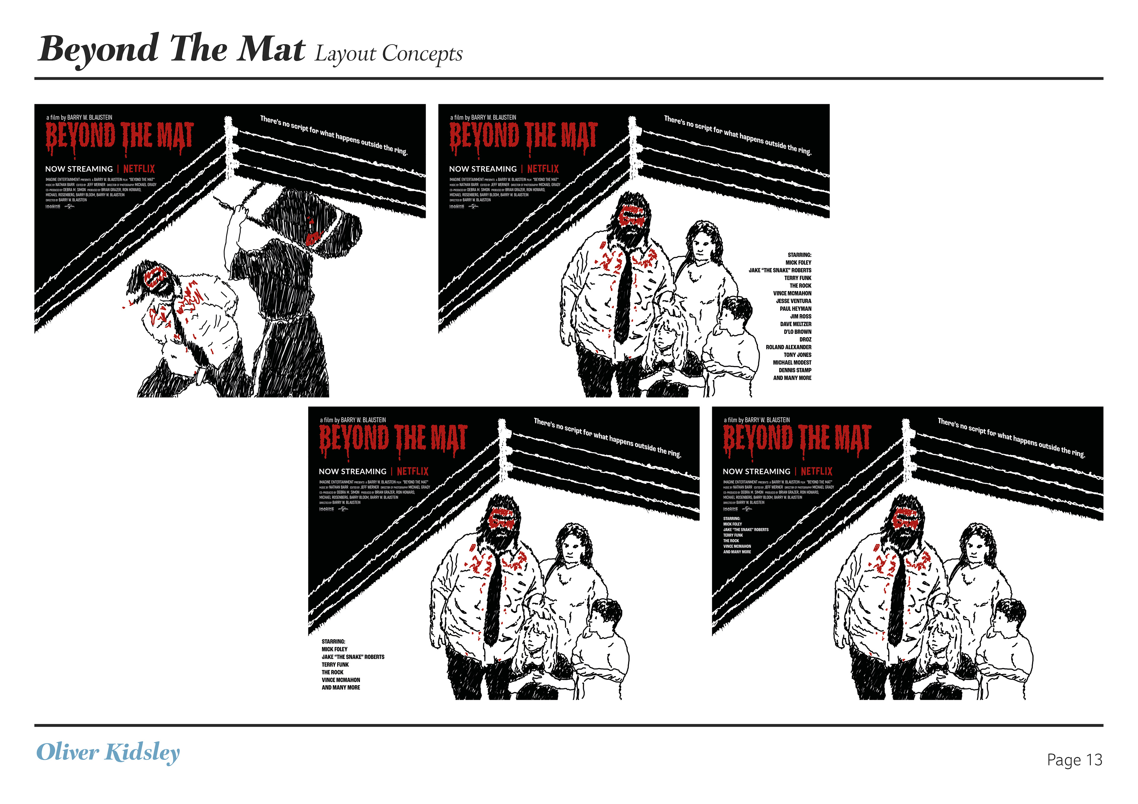
Aim: To create new Key Art and new advertising for the film with Netflix branding
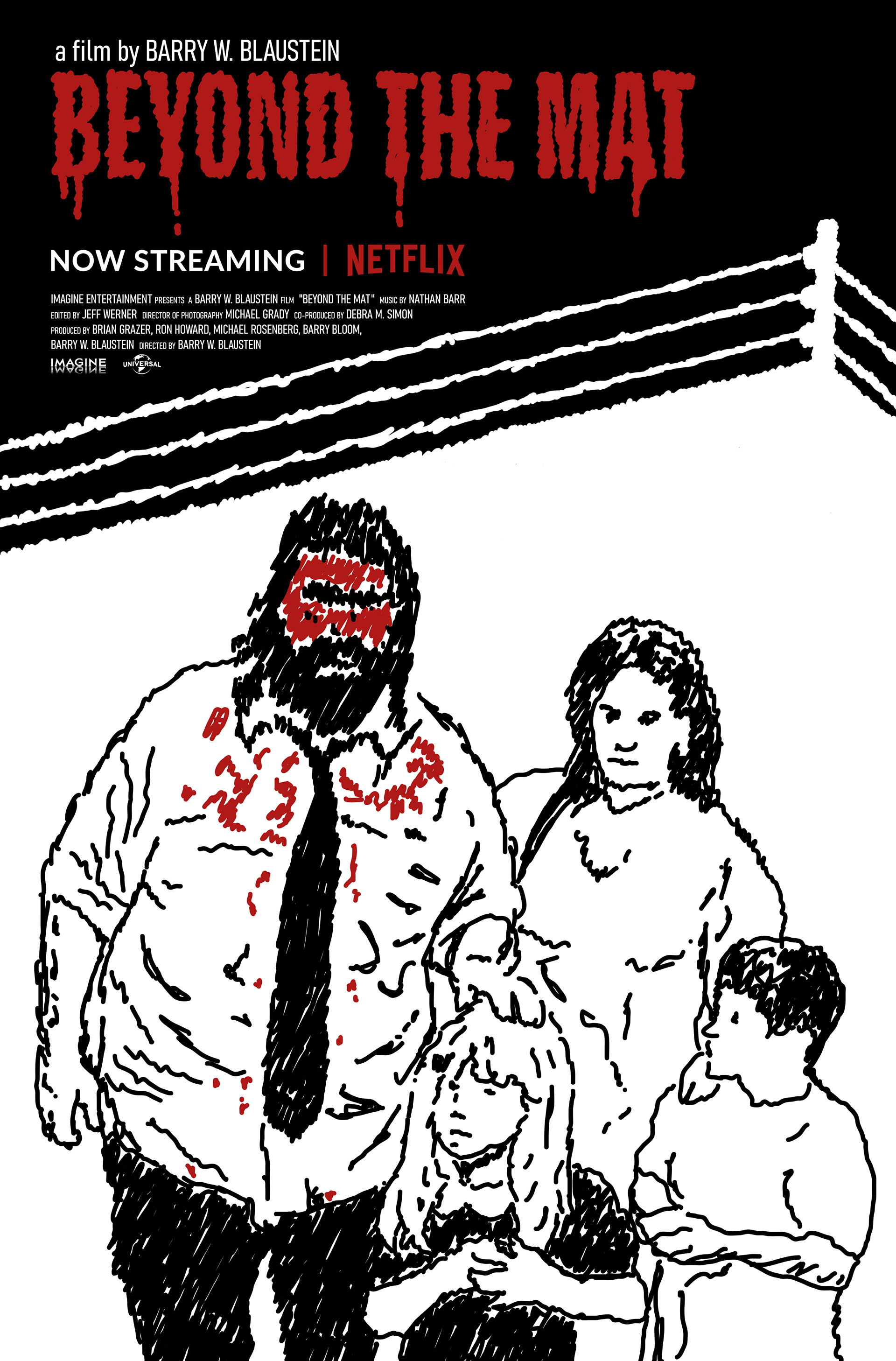
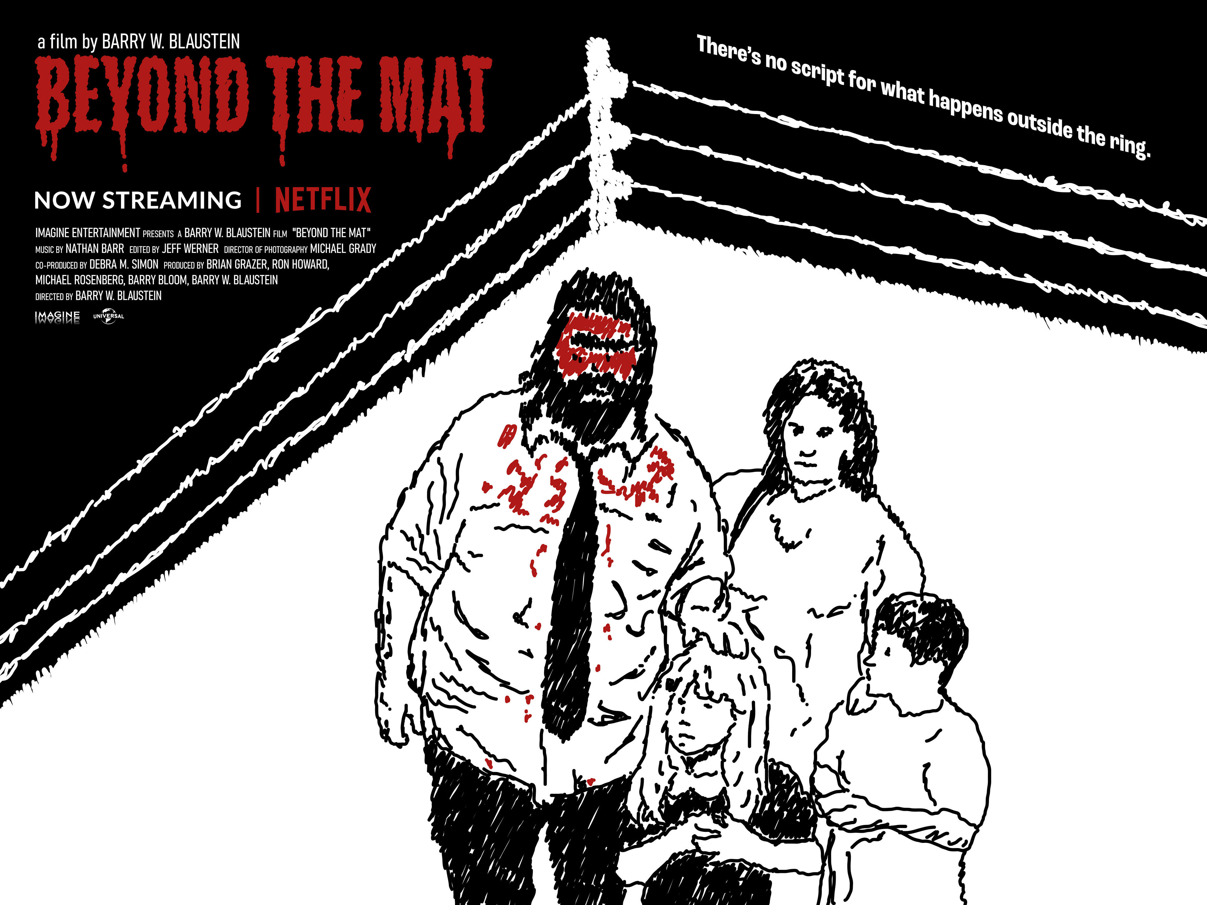
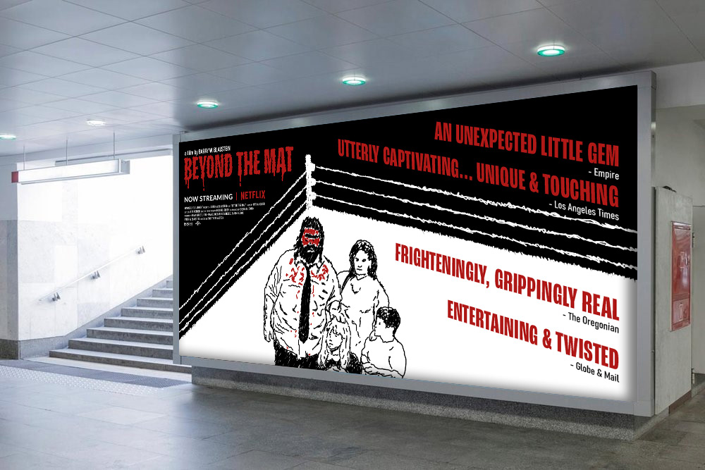
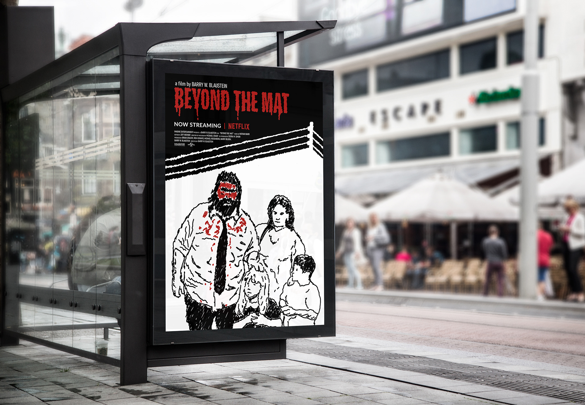
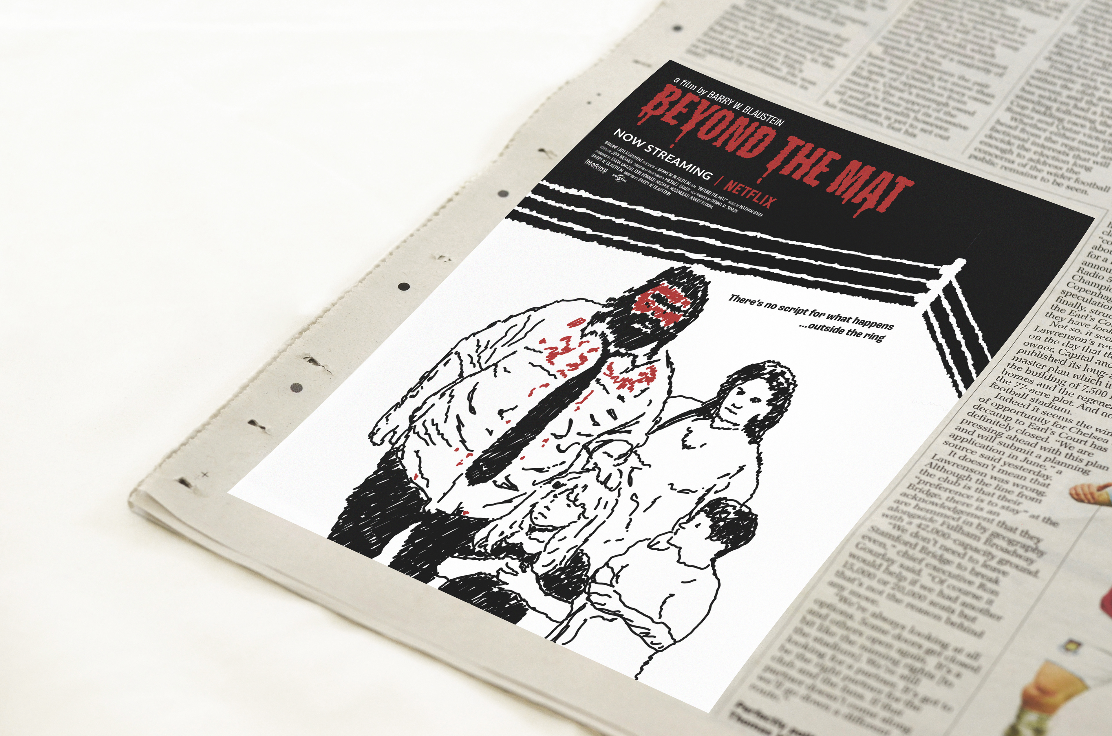
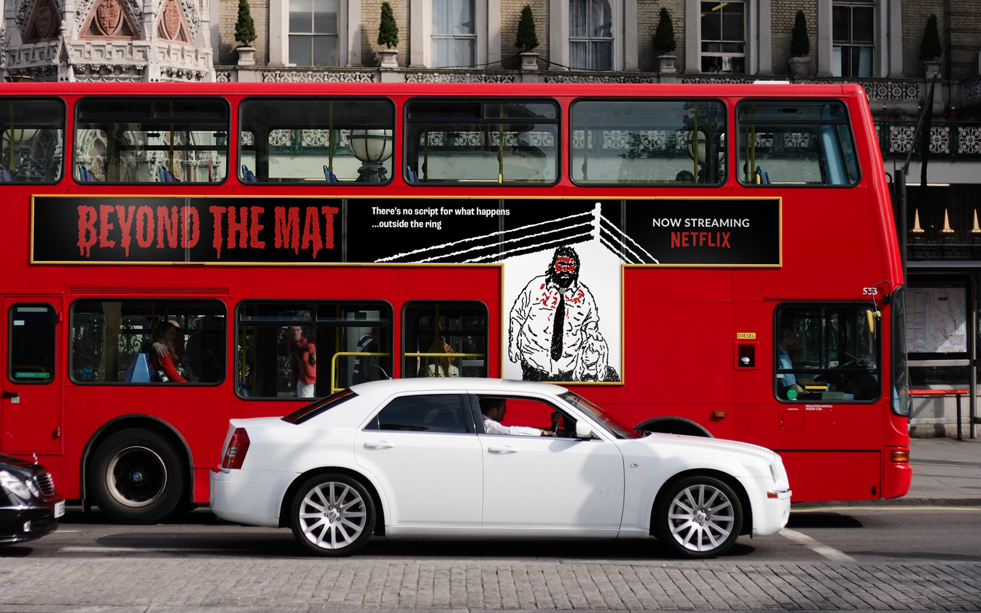
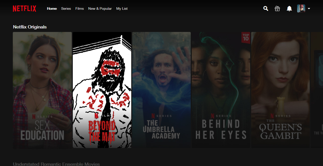
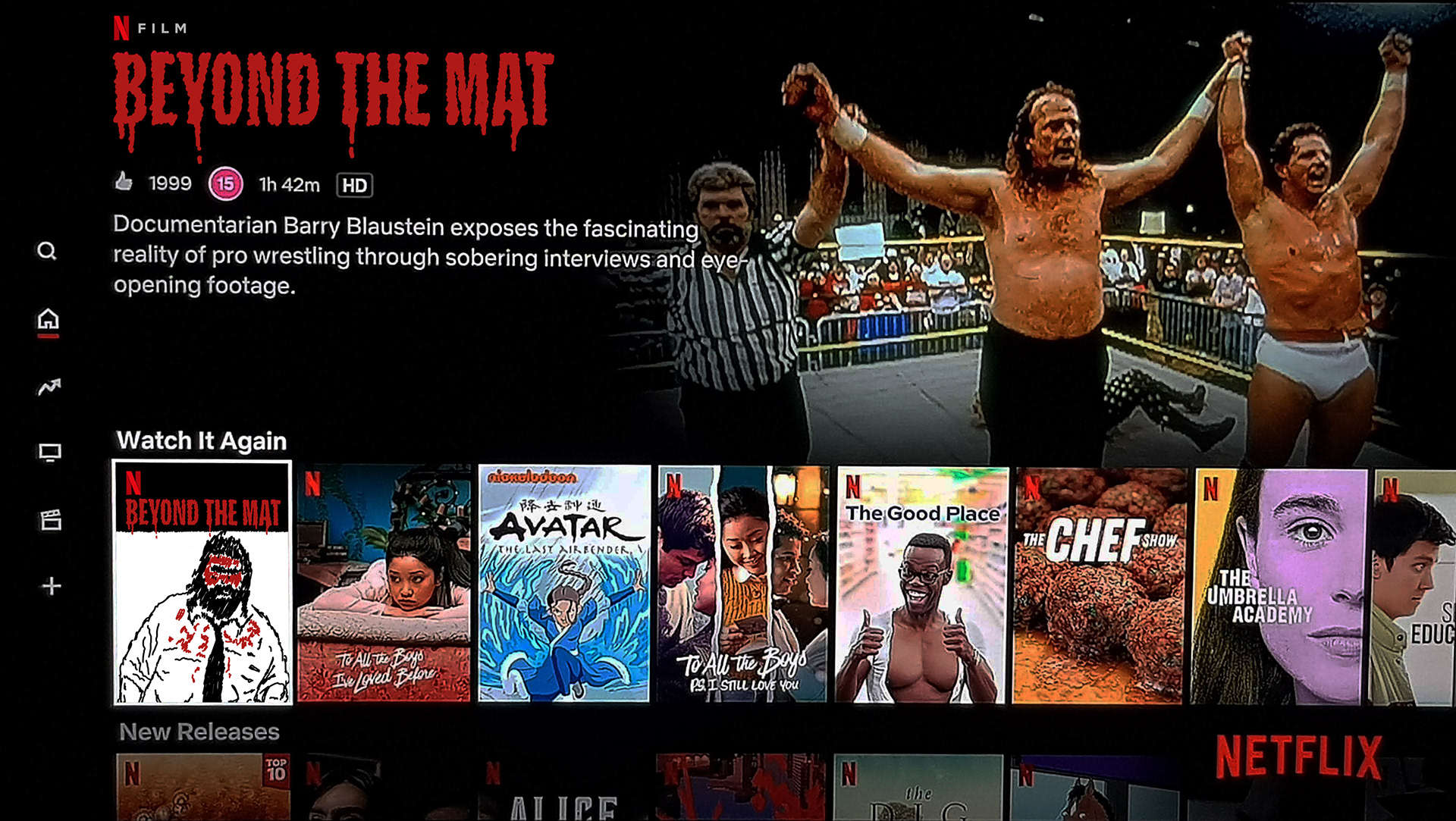
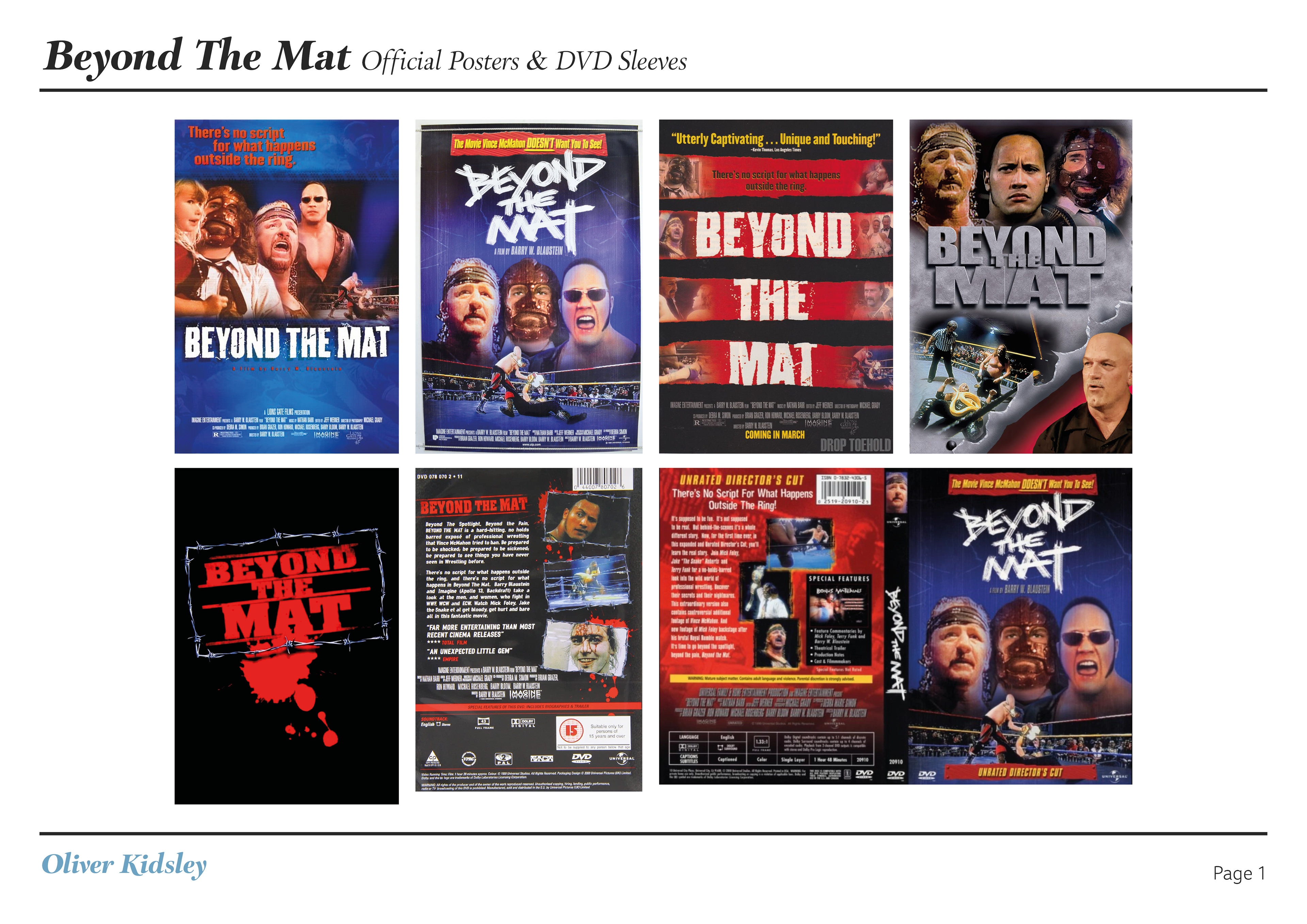
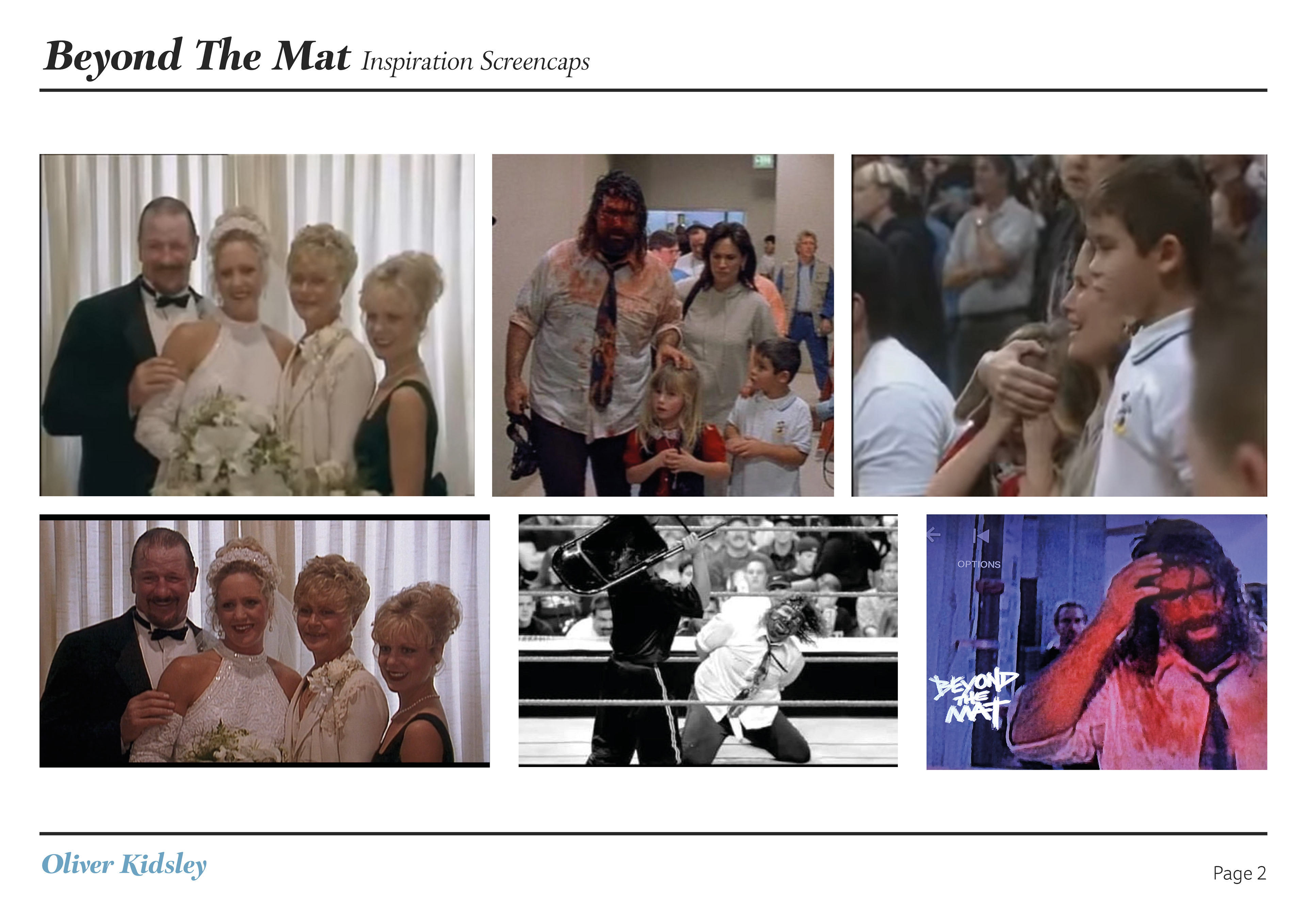
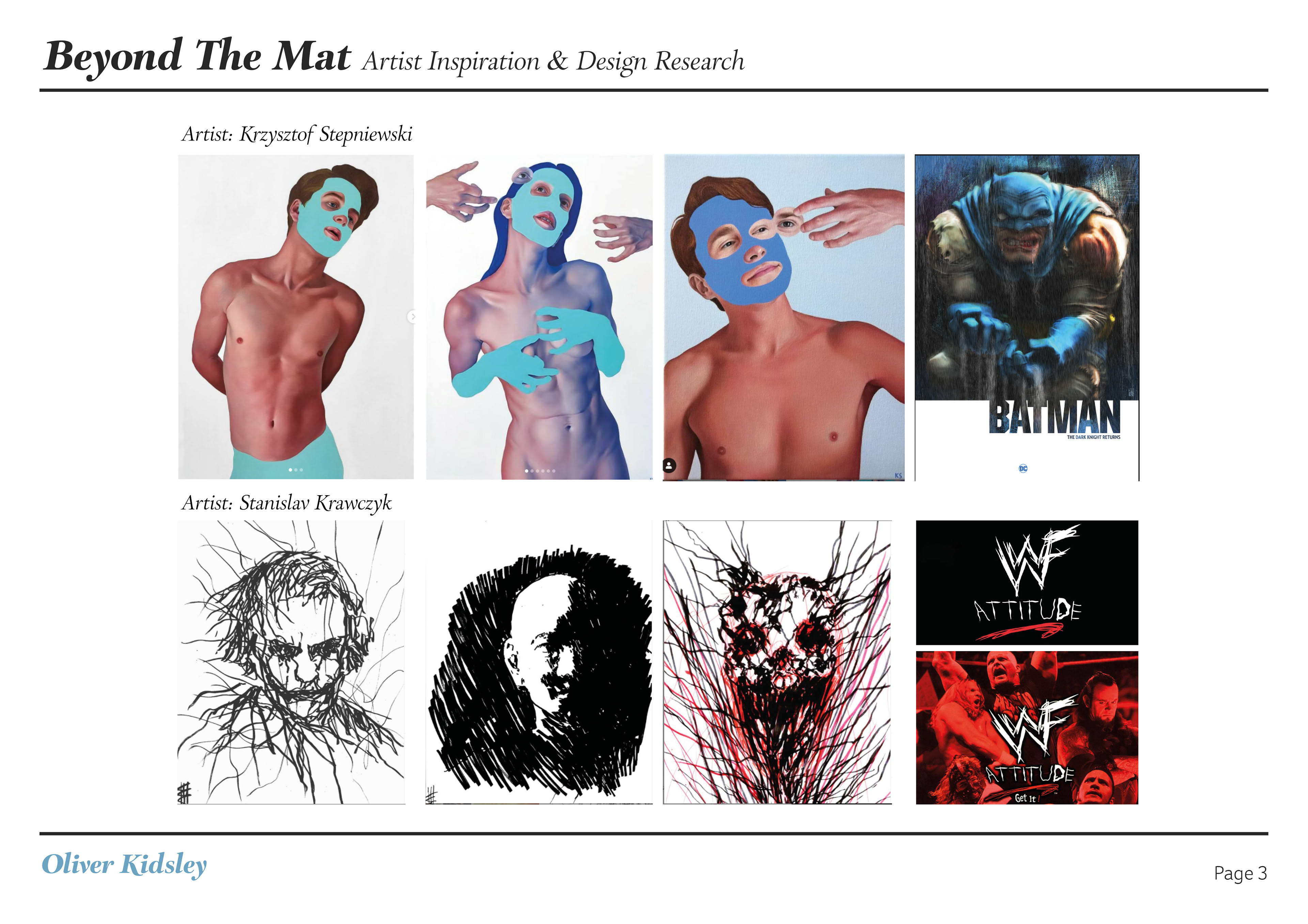
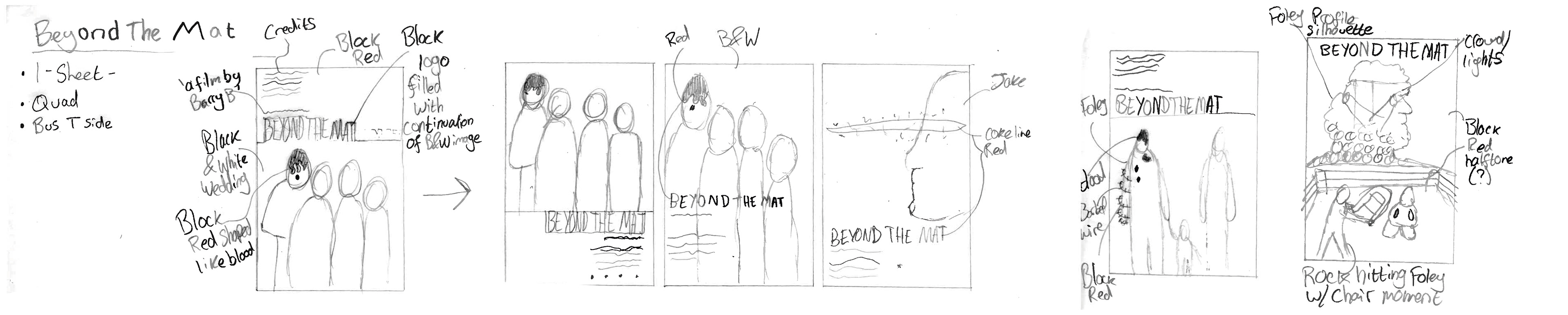
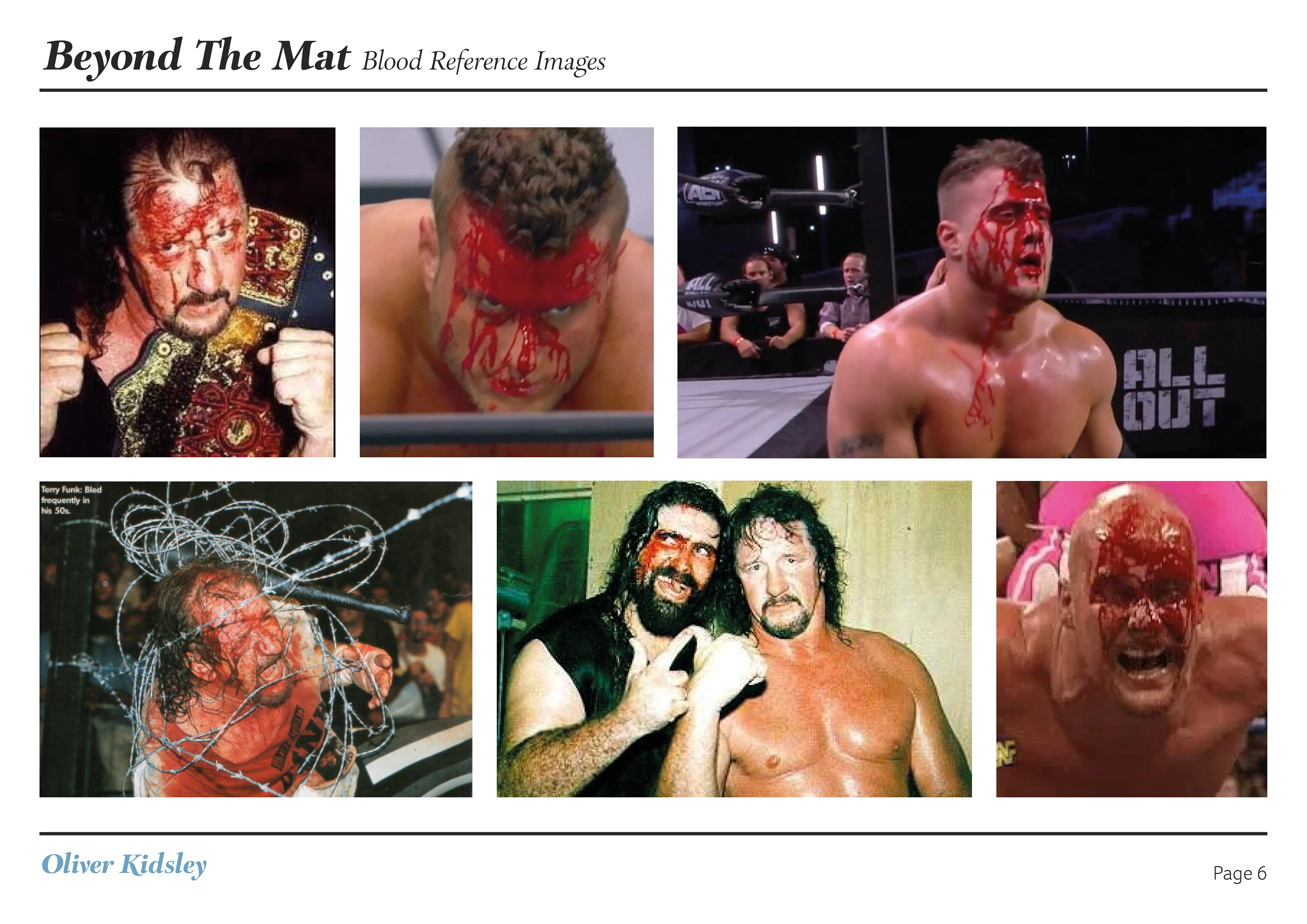
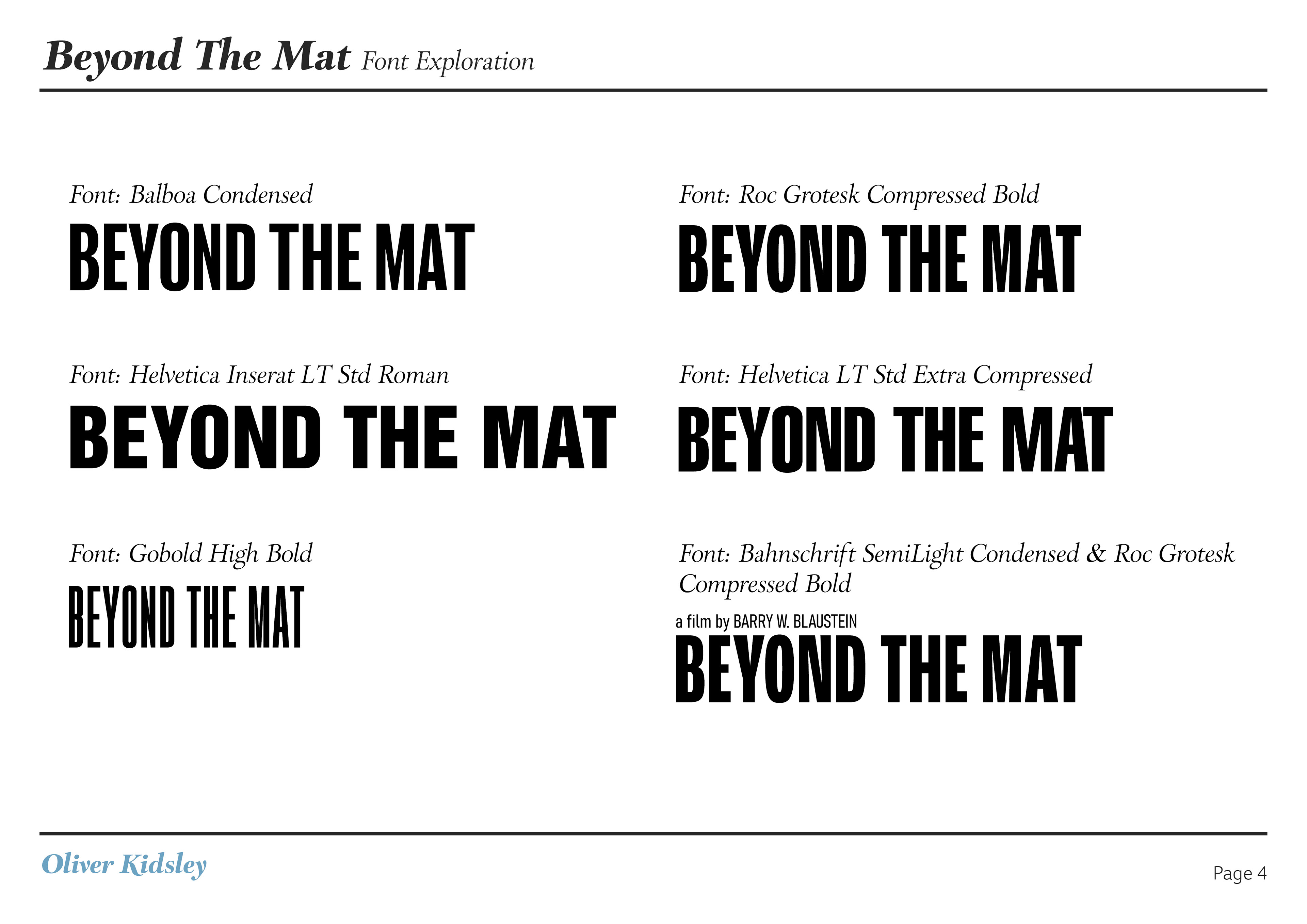
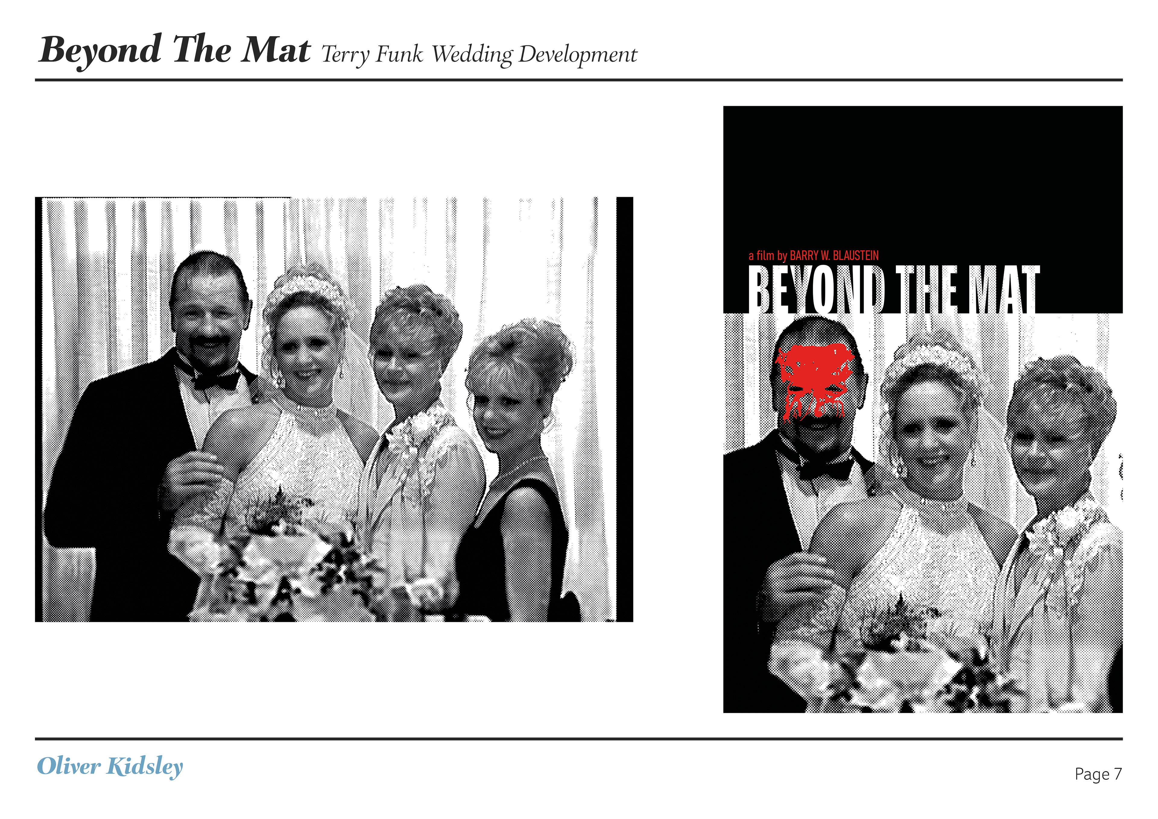
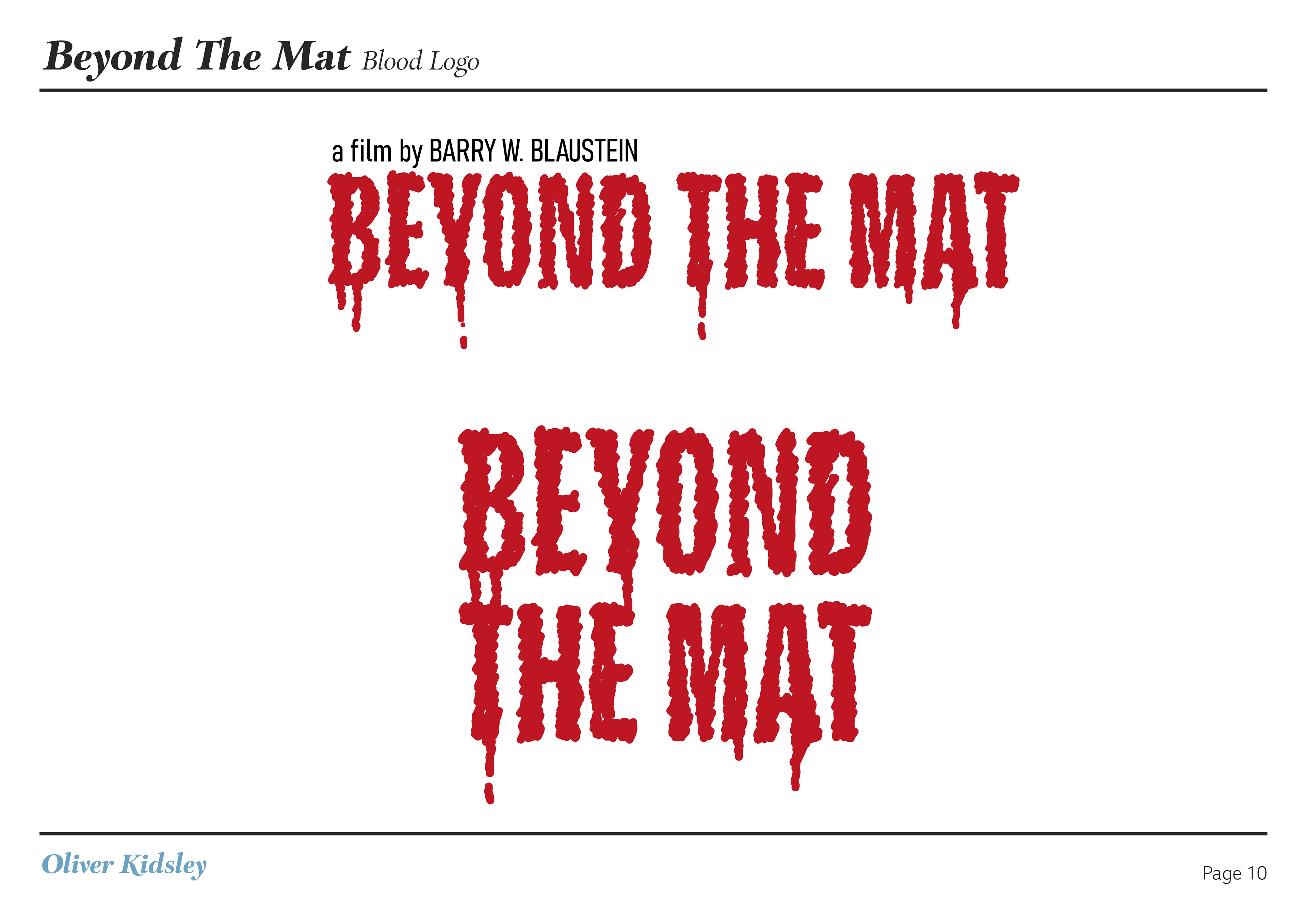
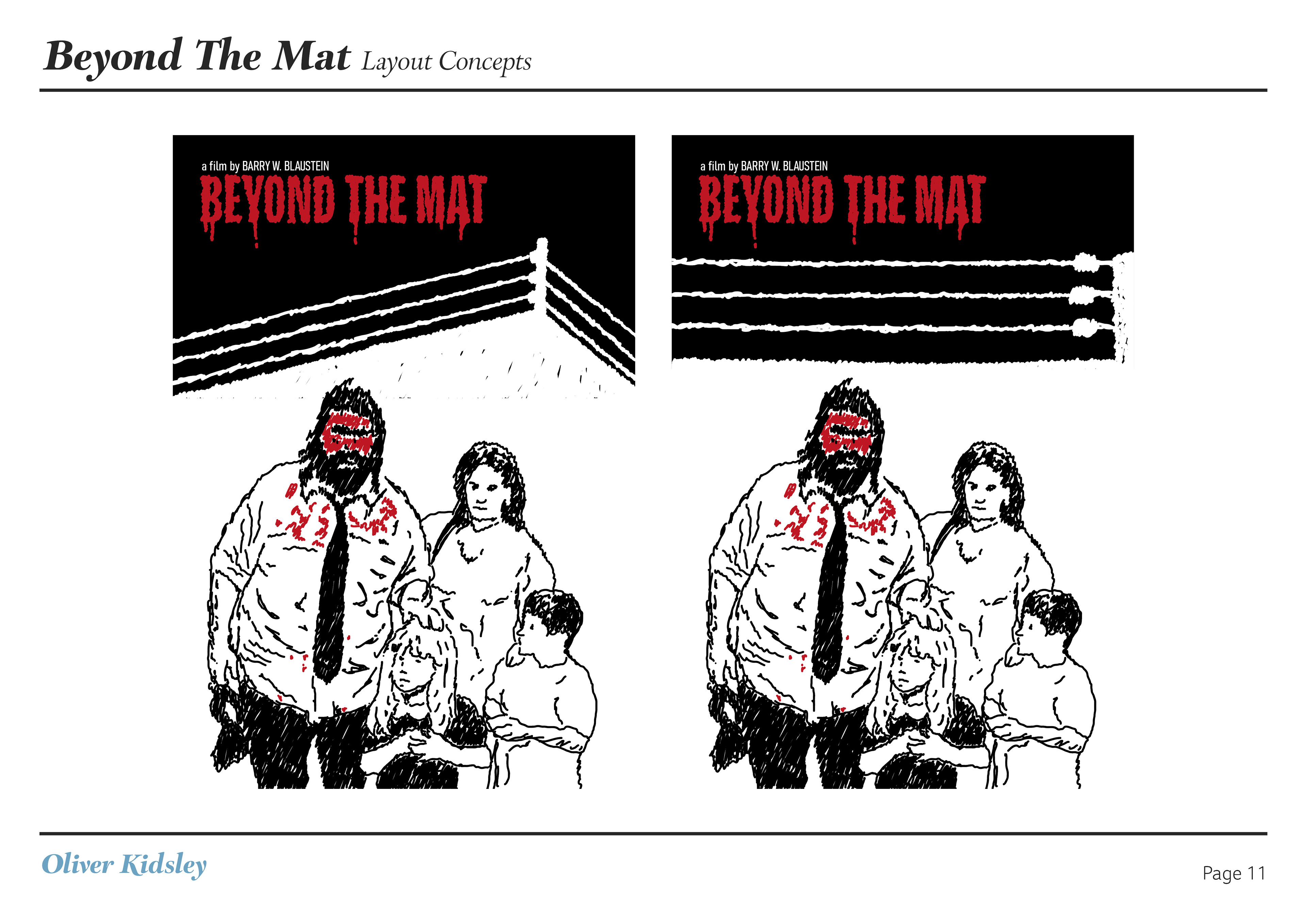
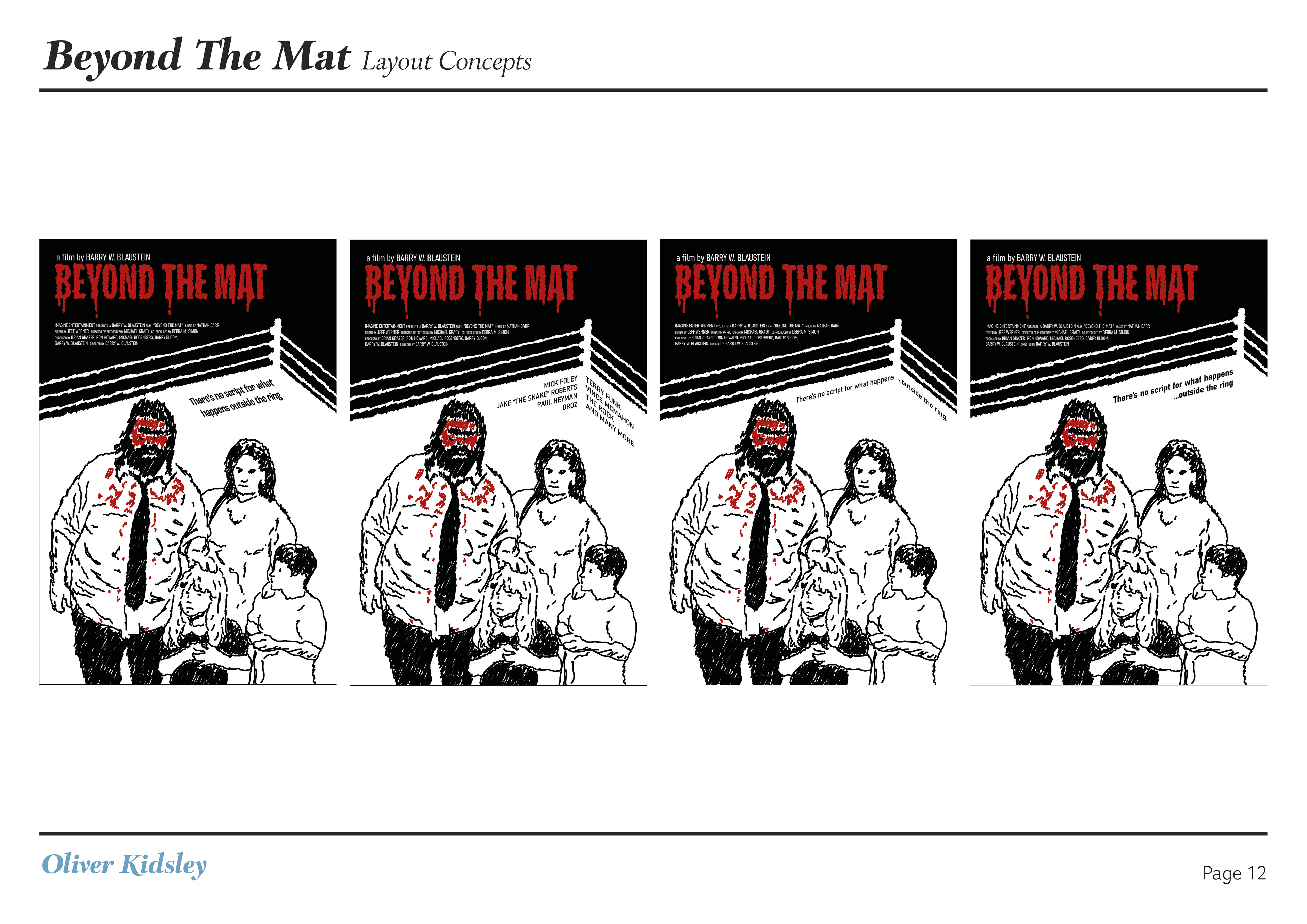
I created a complete rebrand and advertisements for the pro wrestling documentary Beyond The Mat. My aim for this project was to rebrand the film as a Netflix original, as if the original 1999 film had been bought buy Netflix and it was given a new coat of paint. I wanted to do this as I wanted to design within the boundaries of Netflix's branding, and try to replicate that. I also wanted to design new key art for the film as the original artwork felt low budget and lacking to me. Instead of the posters that the film already had I wanted to focus on the personal toll this sport/entertainment franchise has on the real people, similar to the films purpose. My concept was to show a family portrait with the wrestler of the family bleeding from the forehead, as is done within professional wrestling matches, this has an immediate stark contrast between the loving family imagery and the painful, extreme nature of their day job. I wanted this to also stand out by keeping the design mostly black and white, allowing any red for blood to stand out. I originally wanted this concept to be a photomontage, with a flat blood red section over the face, allowing not only the colour difference to be drastic but also the different styles. However as I came to mocking this up it wasn't giving me the desired effect I wanted, and so instead I decided to look at a different route, which led me to my final outcome which was the hand drawn scratched effect. Although this wasn't keeping the idea of stark changes in methods, it did allow the poster and subsequent advertising to have a very recognisable style. This was important to me as the official posters and advertising felt far to generic, not really invoking what the film was about. This style came about very simply, it was based of the WWF (now WWE) logo of the period. Dubbed the 'Attitude Era' WWF employed a scratched white 'W' logo on black with a red underline, this was a change made to turn their previously child friendly image of the 80s into an edgy product that reflected the grunge movement of the 90s. Here it works on my poster as a symbolism to WWF, who are the largest wrestling company in the world and touch everything talked about in the film, and to keeping that edgy tone for the horrifying nature of the image shown and how this effects the family's life, just like the film.
Research & Sketches
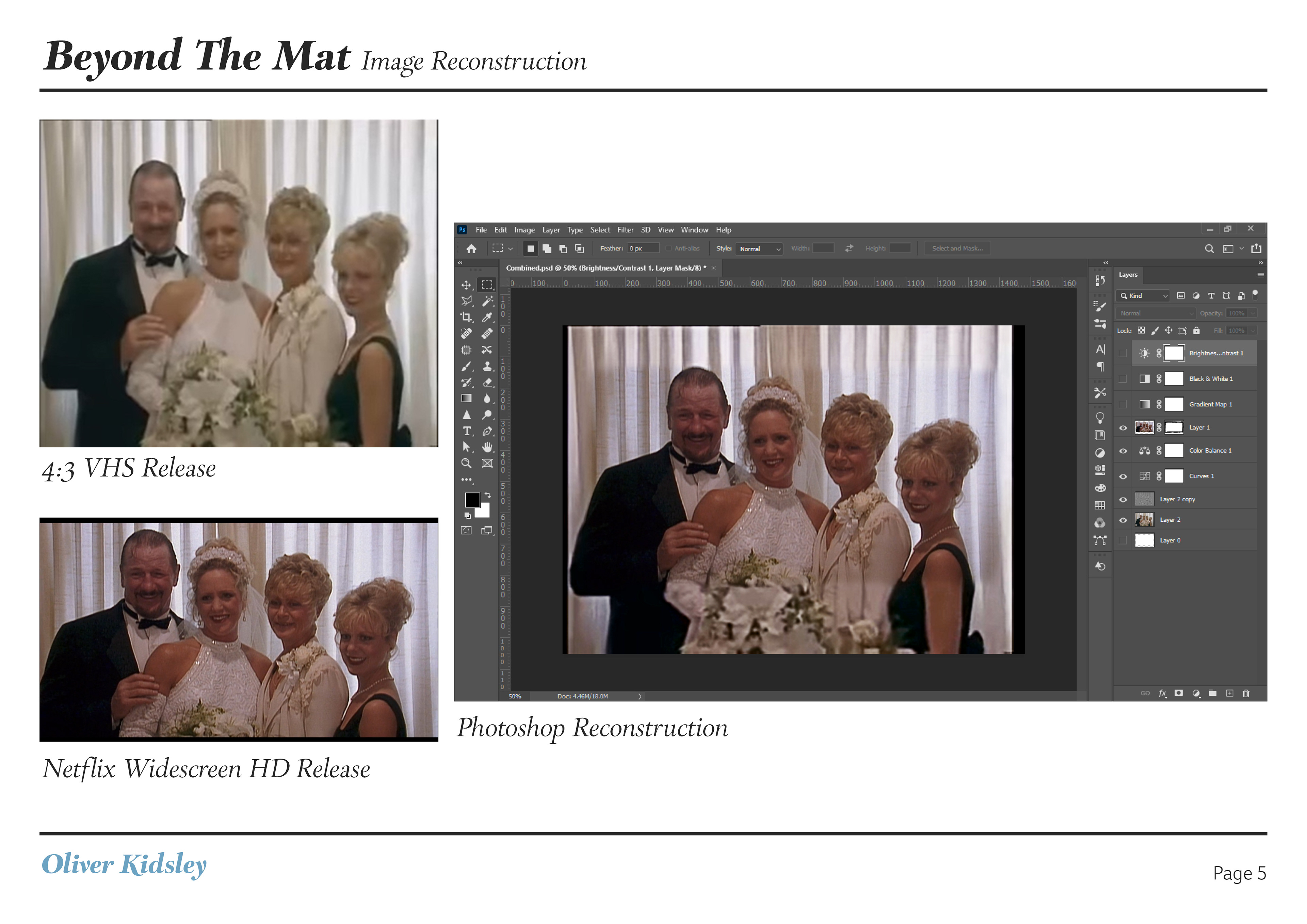
Development
Final Pieces